Grammar Of Graphics
This blog post goes over the theory underlying visualizations in R, which is useful for thinking about building visualizations in general.
Table of Contents
- Setup
- Introduction
- Dataset
- First Plot
- Second Plot
- Multiple Geometries
- Data Transformation
- Optional Elements
- Coordinates and Themes
- Informative Map
- Facet Example
- Closing Thoughts
Setup steps for running the examples yourself
- Download the resourced from github using the “Clone or download” button
- Open RStudio on your machine or choose RStudio from the “New” dropdown menu on ACCRE (it is the last option)
- Run
install.packages("ggplot2")andinstall.packages("png")in RStudio - If using:
- ACCRE
- upload this notebook, the
Metro_Nashville_Public_Schools_Enrollment_and_Demographics.csvcsv file, and thenashville_map.pngimage - make sure the cluster you are running has an R optioin for your Jupyter kernel (otherwise close the cluster and choose a different option)
- upload this notebook, the
- Jupyter locally
- Make sure the R kernel is installed or follow the instructions here
- Run jupyter from the folder with all the resources downloaded from github
- ACCRE
- At this point all the cells should run
- You will need to go through them in order, as some refer to previous outputs
# load libraries

# need to install
library("ggplot2") # visualization library
library("png") # library to read png images

# come pre-installed
library("plyr") #
library("repr") # to set plot dimensions
options(repr.plot.width=10, repr.plot.height=6)
Introduction
R is a programming language written by and for academics. Thus, many libraries in R have an underpinning theory. For ggplot2 that theory is the Grammar of Graphics.
You can purchase the full Grammar of Graphics book here
For some other great tutorials follow the links below:
- Andrew Zieffler
- Data Visualization with ggplot2
- ggplot2 open source book
- Examples of cool visualizations in R
- Grammar of Graphics
The Grammar of Graphics is a framework for thinking about how charts are made that puts the focus on the information being conveyed, not how the image is drawn. Building libraries that implement this paradigm is difficult, and some of the more impressive charts on the R Graph Gallery revert to using shape descriptions to build charts. However, even if the library you are using doesn’t use the grammar of graphics framework, it is a useful framework for mental models that helps chart designers focus on what is important.
Charts, like sentences are meant to convey information. Thus, when building a chart it is important to remember that the goal is not to create a pretty picture, but to communicate with your audience. The grammar of graphics provides a framework for doing this by pulling appart the peices that go into a chart and thinking about how each of them contribute to communicating with the audience.
The goal in building a chart is to convey information in a way that is easy to explain, read and understand. At its core, a chart is made of three components: a dataset, a space where data can be displayed, and visual elements that indicate observations. The grammar of graphics refers to these three parts as the “data”, the “aesthetic” and the “geometry”. The word “grammar” is used in this paradigm to illustrate the similarities between data visualization and the better studied form of communication: writing. In written sentences there are subjects, verbs and objects. Just like sentences, charts can get very complex, but at their core are focused on data, aesthetics and geometries.
Core Elements
A sentence, at its core, has three parts: a subject, an object and a verb. Sometimes parts can be inferred, but usually all three elements are necessary.
Similarly, a chart has three parts: data that is being comuncated, aesthetics that project the data into the space of the chart, and geometries that manefest that projection. Let’s build an example to make these concepts more concrete.
Data
Dataset being plotted
- variables of interest
Aesthetics
Scales onto which we map our data
- axis
- x-axis
- y-axis
- color
- fill
- border
- alpha
- size
- labels
- shape
- lines
- width
- type
Geometries
Visual elements used
- point
- scatter plot
- dotplot
- line
- line chart
- best fit plotting
- area
- histogram
- bar chart
- pie chart
Dataset
For this tutorial we will use the Metro Nashville school data, which is publically available data on the demographics and location of each school in Nashville.
The code below loads this dataset, edits a couple columns and adds a column with the total number of students in each school.
# read in data downloaded from https://data.nashville.gov/browse?category=Education
schools <- read.csv('Metro_Nashville_Public_Schools_Enrollment_and_Demographics.csv')

# have a column with the total number of students in each school
schools$Total <- schools$Male + schools$Female

# zip codes should be a categorical, not numerical
schools$Zip.Code <- as.factor(schools$Zip.Code)

# order school types in a way that makes sense
school_levels = c('Elementary School',
                  'Middle School',
                  'High School',
                  'Charter',
                  'Non-Traditional',
                  'Non-Traditional - Hybrid',
                  'Alternative Learning Center',
                  'Special Education',
                  'GATE Center',
                  'Adult'
                  )
# by resetting the levels of a factor, we can change the default ordering
schools$School.Level <- factor(schools$School.Level, levels = school_levels)
R has many nice functions for viewing samples and statistics of a dataframe such as head, tail and summary:
head(schools)
| School.Year | School.Level | School.ID | School.Name | State.School.ID | Zip.Code | Grade.PreK.3yrs | Grade.PreK.4yrs | Grade.K | Grade.1 | ... | White | Male | Female | Economically.Disadvantaged | Disability | Limited.English.Proficiency | Latitude | Longitude | Mapped.Location | Total |
|---|---|---|---|---|---|---|---|---|---|---|---|---|---|---|---|---|---|---|---|---|
| 18-19 | Elementary School | 496 | A. Z. Kelley Elementary | 1 | 37013 | NA | 40 | 153 | 146 | ... | 218 | 423 | 424 | 300 | 91 | 301 | 36.02182 | -86.65885 | (36.02181712, -86.65884778) | 847 |
| 18-19 | Elementary School | 375 | Alex Green Elementary | 5 | 37189 | NA | 37 | 53 | 46 | ... | 15 | 123 | 143 | 183 | 19 | 25 | 36.25296 | -86.83223 | (36.2529607, -86.8322292) | 266 |
| 18-19 | Elementary School | 105 | Amqui Elementary | 10 | 37115 | 2 | 29 | 91 | 81 | ... | 73 | 230 | 234 | 244 | 47 | 122 | 36.27377 | -86.70383 | (36.27376585, -86.70383153) | 464 |
| 18-19 | Elementary School | 460 | Andrew Jackson Elementary | 15 | 37138 | 4 | 29 | 93 | 85 | ... | 270 | 252 | 250 | 99 | 66 | 33 | 36.23158 | -86.62377 | (36.23158465, -86.62377469) | 502 |
| 18-19 | High School | 110 | Antioch High School | 20 | 37013 | NA | NA | NA | NA | ... | 442 | 1047 | 909 | 716 | 223 | 544 | 36.04667 | -86.59942 | (36.04667464, -86.59941833) | 1956 |
| 18-19 | Middle School | 111 | Antioch Middle | 23 | 37013 | NA | NA | NA | NA | ... | 112 | 396 | 386 | 403 | 97 | 391 | 36.05538 | -86.67183 | (36.05537897, -86.67182989) | 782 |
summary(schools)
 School.Year            School.Level   School.ID
 18-19:169   Elementary School:76    Min.   :100.0
             Middle School    :31    1st Qu.:296.0
             Charter          :31    Median :497.0
             High School      :17    Mean   :461.7
             Non-Traditional  : 5    3rd Qu.:613.0
             Special Education: 3    Max.   :805.0
             (Other)          : 6
                    School.Name  State.School.ID    Zip.Code  Grade.PreK.3yrs
 A. Z. Kelley Elementary  :  1   Min.   :    1   37013  :21   Min.   :  1.00
 Alex Green Elementary    :  1   1st Qu.:  255   37207  :15   1st Qu.:  4.00
 Amqui Elementary         :  1   Median :  456   37209  :15   Median :  6.00
 Andrew Jackson Elementary:  1   Mean   : 2411   37211  :15   Mean   : 17.31
 Antioch High School      :  1   3rd Qu.:  704   37206  :12   3rd Qu.: 14.50
 Antioch Middle           :  1   Max.   :90001   37210  : 9   Max.   :241.00
 (Other)                  :163                   (Other):82   NA's   :130
 Grade.PreK.4yrs     Grade.K          Grade.1         Grade.2
 Min.   :  6.00   Min.   : 31.00   Min.   :  2.0   Min.   :  4.0
 1st Qu.: 27.00   1st Qu.: 53.25   1st Qu.: 55.0   1st Qu.: 55.5
 Median : 37.00   Median : 86.00   Median : 79.0   Median : 77.5
 Mean   : 42.97   Mean   : 85.91   Mean   : 81.9   Mean   : 81.7
 3rd Qu.: 43.00   3rd Qu.:108.75   3rd Qu.:100.0   3rd Qu.:102.8
 Max.   :192.00   Max.   :188.00   Max.   :177.0   Max.   :177.0
 NA's   :104      NA's   :87       NA's   :86      NA's   :85
    Grade.3          Grade.4          Grade.5          Grade.6
 Min.   :  1.00   Min.   :  7.00   Min.   :  4.00   Min.   :  3.0
 1st Qu.: 56.50   1st Qu.: 59.00   1st Qu.: 79.75   1st Qu.: 86.0
 Median : 76.00   Median : 76.50   Median :119.00   Median :119.5
 Mean   : 81.17   Mean   : 81.24   Mean   :121.20   Mean   :124.7
 3rd Qu.:104.50   3rd Qu.:103.75   3rd Qu.:166.25   3rd Qu.:170.0
 Max.   :174.00   Max.   :167.00   Max.   :261.00   Max.   :250.0
 NA's   :86       NA's   :87       NA's   :113      NA's   :115
    Grade.7          Grade.8          Grade.9         Grade.10
 Min.   :  6.00   Min.   :  1.00   Min.   :  9.0   Min.   :  3.0
 1st Qu.: 76.75   1st Qu.: 78.75   1st Qu.: 86.0   1st Qu.: 40.0
 Median :106.50   Median :112.00   Median :152.5   Median :141.0
 Mean   :113.89   Mean   :113.38   Mean   :188.9   Mean   :175.6
 3rd Qu.:150.25   3rd Qu.:152.25   3rd Qu.:259.8   3rd Qu.:250.2
 Max.   :242.00   Max.   :244.00   Max.   :568.0   Max.   :598.0
 NA's   :113      NA's   :113      NA's   :137     NA's   :137
    Grade.11        Grade.12   American.Indian.or.Alaska.Native
 Min.   :  8.0   Min.   :  6   Min.   :1.000
 1st Qu.: 64.5   1st Qu.: 48   1st Qu.:1.000
 Median :146.0   Median :117   Median :1.000
 Mean   :185.9   Mean   :160   Mean   :1.842
 3rd Qu.:250.5   3rd Qu.:238   3rd Qu.:2.000
 Max.   :570.0   Max.   :539   Max.   :6.000
 NA's   :138     NA's   :136   NA's   :74
     Asian        Black.or.African.American Hispanic.Latino
 Min.   :  1.00   Min.   :  3               Min.   :  1.0
 1st Qu.:  4.00   1st Qu.:102               1st Qu.: 26.0
 Median : 11.00   Median :194               Median : 78.0
 Mean   : 24.86   Mean   :212               Mean   :132.4
 3rd Qu.: 30.75   3rd Qu.:260               3rd Qu.:180.0
 Max.   :197.00   Max.   :914               Max.   :764.0
 NA's   :23
 Native.Hawaiian.or.Other.Pacific.Islander     White            Male
 Min.   :1.000                             Min.   :  3.0   Min.   :  13.0
 1st Qu.:1.000                             1st Qu.: 32.0   1st Qu.: 152.0
 Median :1.000                             Median : 88.0   Median : 229.0
 Mean   :1.721                             Mean   :144.3   Mean   : 261.2
 3rd Qu.:2.000                             3rd Qu.:207.0   3rd Qu.: 322.0
 Max.   :6.000                             Max.   :882.0   Max.   :1141.0
 NA's   :101
     Female       Economically.Disadvantaged   Disability
 Min.   :   4.0   Min.   : 10.0              Min.   :  1.00
 1st Qu.: 143.0   1st Qu.:126.8              1st Qu.: 38.00
 Median : 229.0   Median :197.0              Median : 53.00
 Mean   : 250.8   Mean   :215.0              Mean   : 64.45
 3rd Qu.: 320.0   3rd Qu.:270.8              3rd Qu.: 78.00
 Max.   :1135.0   Max.   :869.0              Max.   :335.00
                  NA's   :1
 Limited.English.Proficiency    Latitude       Longitude
 Min.   :  1.0               Min.   :36.02   Min.   :-86.96
 1st Qu.: 17.0               1st Qu.:36.10   1st Qu.:-86.80
 Median : 65.0               Median :36.16   Median :-86.75
 Mean   :122.3               Mean   :36.15   Mean   :-86.75
 3rd Qu.:182.0               3rd Qu.:36.20   3rd Qu.:-86.70
 Max.   :688.0               Max.   :36.32   Max.   :-86.58
 NA's   :6                   NA's   :1       NA's   :1
                    Mapped.Location     Total
                            :  1    Min.   :  17
 (36.02017398, -86.7122071) :  1    1st Qu.: 297
 (36.02103117, -86.71463119):  1    Median : 444
 (36.02181712, -86.65884778):  1    Mean   : 512
 (36.0223006, -86.66127077) :  1    3rd Qu.: 652
 (36.03028843, -86.62123021):  1    Max.   :2276
 (Other)                    :163
First Plot
Now let us define the data, aesthetic and geometry for a plot.
For this first plot, the data is the schools data frame we just read in.
We map the School.Level column to the x axis for the aesthetic and use a bar chart as our geometry. The y axis will the statistic of the number of observations for each School.Level.
# set the data
data <- schools
# choose the aesthetics
aesthetic <- aes(x=School.Level)
# set the geometry (sometimes we have to specify a statstic)
geometry <- geom_bar(stat="count")
We put these to together into a “sentence” by running ggplot(data, aesthetic) + geometry
ggplot(data, aesthetic) + geometry
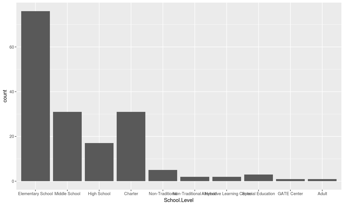
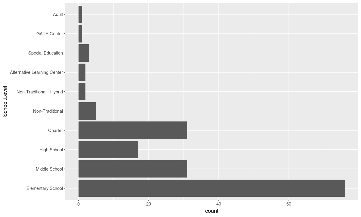
At the end, + coord_flip() can be added to swap the x and y axis. This is helpful in this example where the school names are long and easier to read horizontally.
ggplot(data, aesthetic) + geometry + coord_flip()
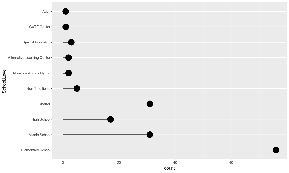
This plot can be changed into a lollipop plot by editting the geometries used
# a geometry for the stems
geometry_1 <- geom_bar(stat="count", width=.05)
# a geometry for the tops
geometry_2 <- geom_point(stat="count", size=7)

ggplot(data, aesthetic) + geometry_1 + geometry_2 + coord_flip()
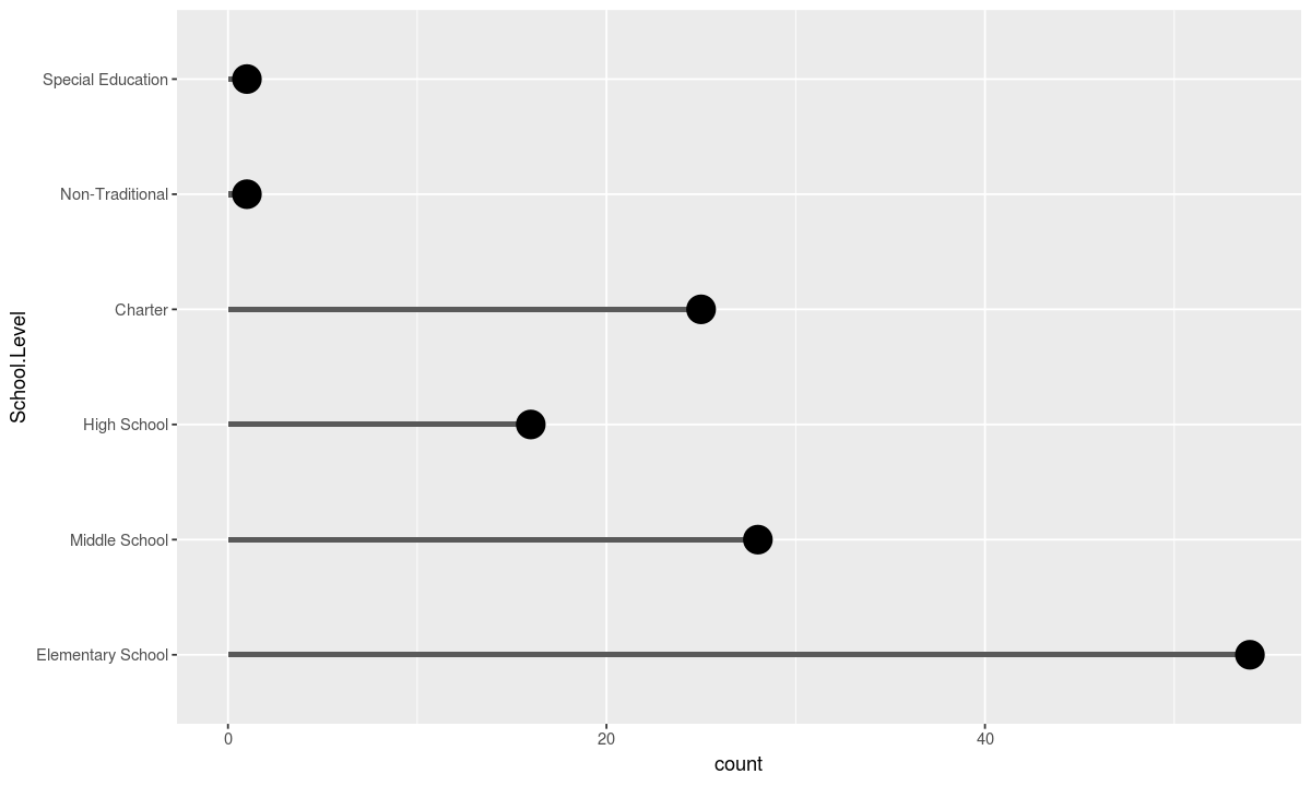
Each component can be slotted in and out like a puzzle peice.
For instance we can edit the data to only be those schools with at least 300 students and redraw the plot:
data <- schools[schools$Total > 300, ]

ggplot(data, aesthetic) + geometry_1 + geometry_2 + coord_flip()
Just as sentences can be thought of as the combination of “fragments” that are not complete on their own, charts in the grammar of graphics can be viewed as the sum of multiple “fragments”.
For example, a chart with data and aesthetics but no geometries defines the space into which the data will be plotted but doesn’t include shapes to add meaning to that space.
The code below gives an example of such a “partial” chart:
ggplot(data, aesthetic)
Second Plot
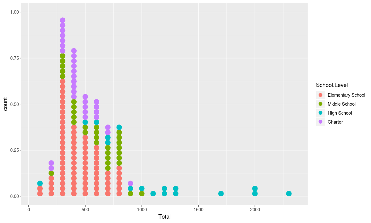
Turning to numerical data, let’s see how many students attend each level of school in Nashville.
This time our aesthetic will have the numerical column “Total” on the x axis and we will use the color fill dimension to display the School.Level
# use Nasvhille schools as data again
data <- schools

# this time put the total number of students in each school on the x axis
# use fill to indicate the type of school
aesthetic <- aes(x=Total, fill=School.Level)

# use the histogram geometry
geometry <- geom_histogram(binwidth=100)

# plot it
ggplot(data, aesthetic) + geometry
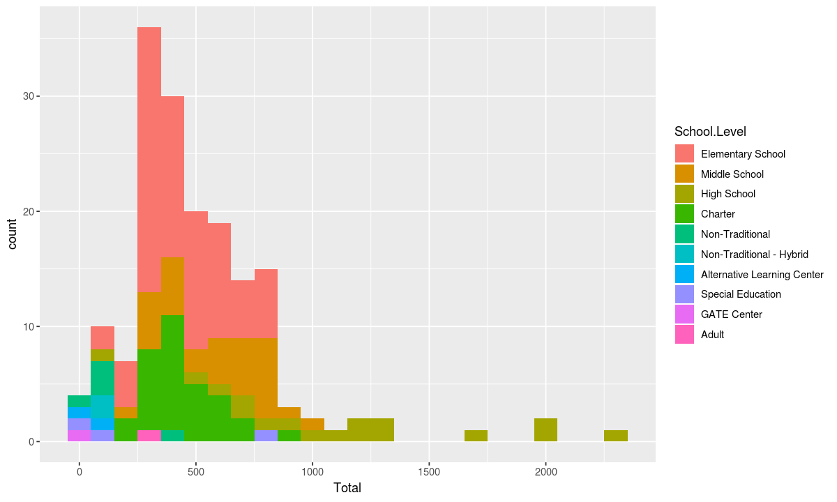
The plot above shows that Nashville has some very large high schools and various types of alternative learning and non-traditional schools that are fairly small.
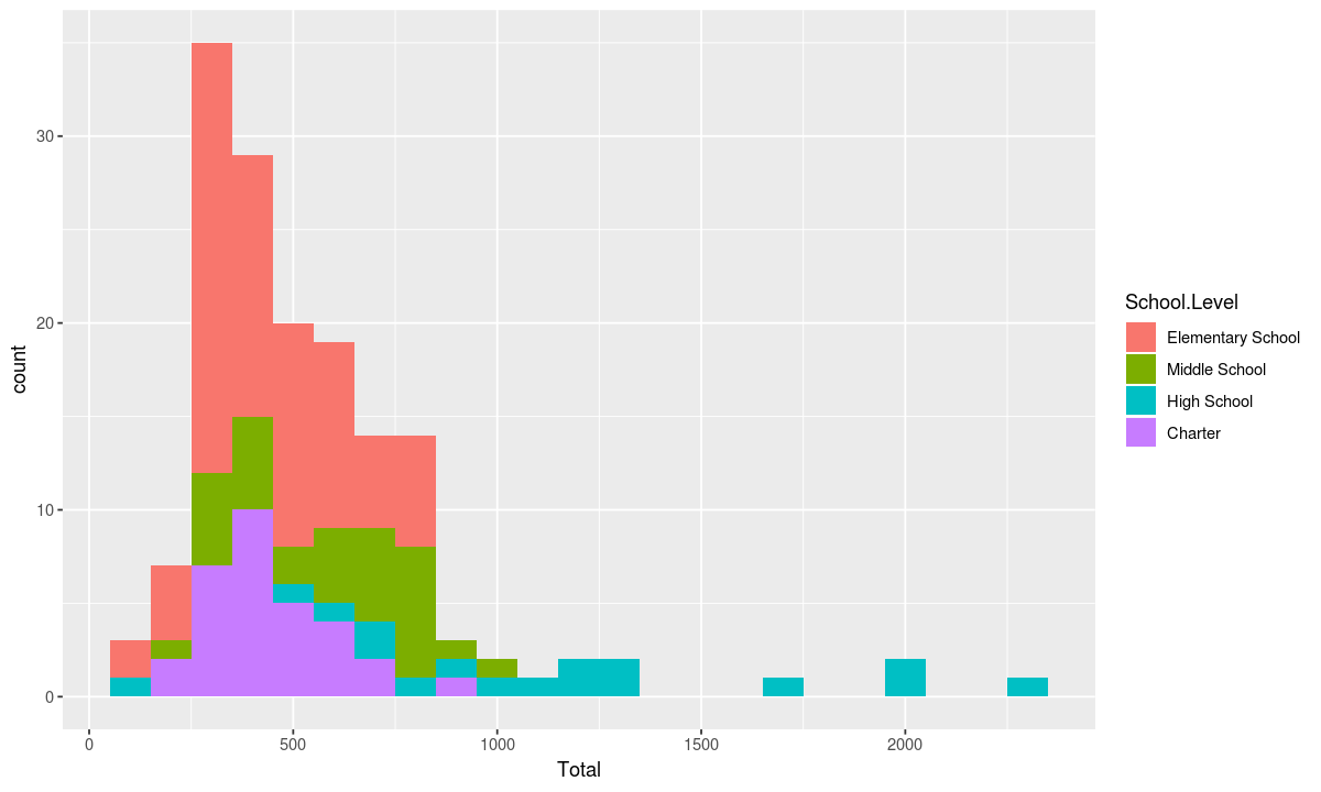
If we feel there are too many School.Levels and we are actually only interested in elementary, middle, high, and charter schools, we can edit our data to only show those school types.
# change the data
data <- schools[schools$School.Level %in% c("High School", "Elementary School", "Middle School", "Charter"), ]

# plot it
ggplot(data, aesthetic) + geometry
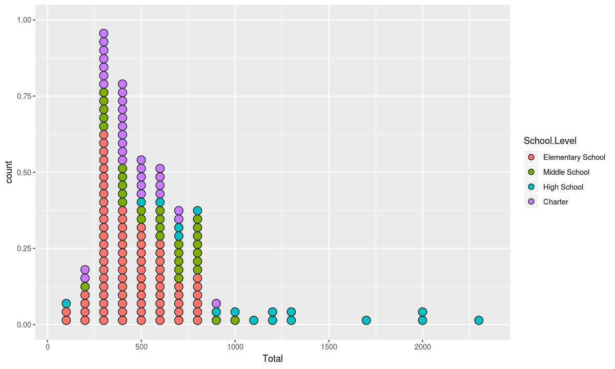
Just as lollipop charts can be used as an alternative to bar charts, dot plots can be used instead of histograms to show each school individually
# use dotplot
geometry <- geom_dotplot(binwidth=100, dotsize=.45, binpositions="all", stackgroups=TRUE, method="histodot")

# plot it
ggplot(data, aesthetic) + geometry
If you would like the border color of each dot to match the fill color, you can accomplish this by adding an aesthetic with a mapping from School.Level to color to the chart.
This could also be done by adding an aesthetic as the first arguement to the geometry or editting the aethetic using the commands:
ggplot(data, aesthetic) + geom_dotplot(aes(color=School.Level), binwidth=100, dotsize=.45, binpositions="all", stackgroups=TRUE, method="histodot")
or
ggplot(data, aes(x=Total, fill=School.Level, color=School.Level)) + geometry
# add the aesthetic and plot
ggplot(data, aesthetic) + aes(color=School.Level) + geometry
Multiple Geometries
Now let’s look at another way to plot that information by changing the geometry and aesthetics
# use Nasvhille schools as data again
data <- schools #[schools$School.Level %in% c("High School", "Elementary School", "Middle School", "Charter"), ]
# put the total number of students in each school on the x axis
# and the school type on the y axis
aesthetic <- aes(x=School.Level, y=Total)
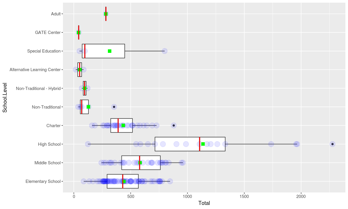
# use the boxplot geometry
geometry <- geom_boxplot()
ggplot(data, aesthetic) + geometry +
# swap the x and y axes
coord_flip()
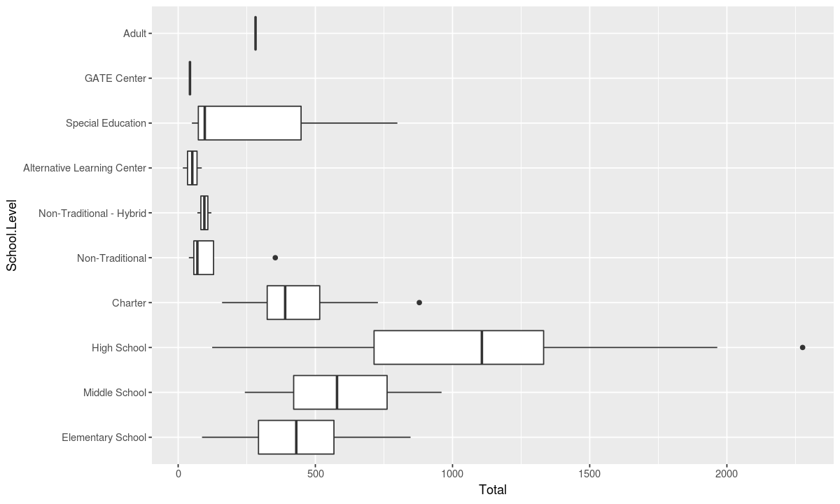
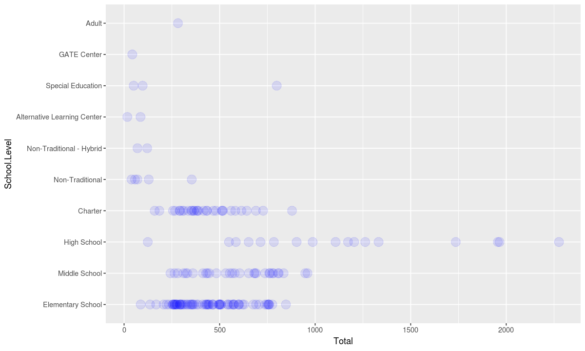
A boxplot is meant to show a distribution. Alternative methods of displaying distributions include plotting all the points in dataset. To demonstrate where multiple points are present, we can use a low alpha value.
ggplot(data, aesthetic) +
# show each point in the dataset indivually and use a low alpha value so stacked points can be seen
geom_point(stat = "identity", alpha=.1, size=5, color="blue") +
coord_flip()
Boxplots also display some statistics to describe the distribution such as the median and various percentiles. Statistics can also be added as seperate geometries to any plot.
ggplot(data, aesthetic) +
geom_point(stat = "identity", alpha=.1, size=5, color="blue") +
# show the mean as a green square overlayed on the distribution
geom_point(stat = "summary", fun.y = "mean", size=3, shape="square", color="green") +
# show the median as a red line overlayed on the distribution
geom_point(stat = "summary", fun.y = "median", shape="|", size=10, color="red") +
coord_flip()
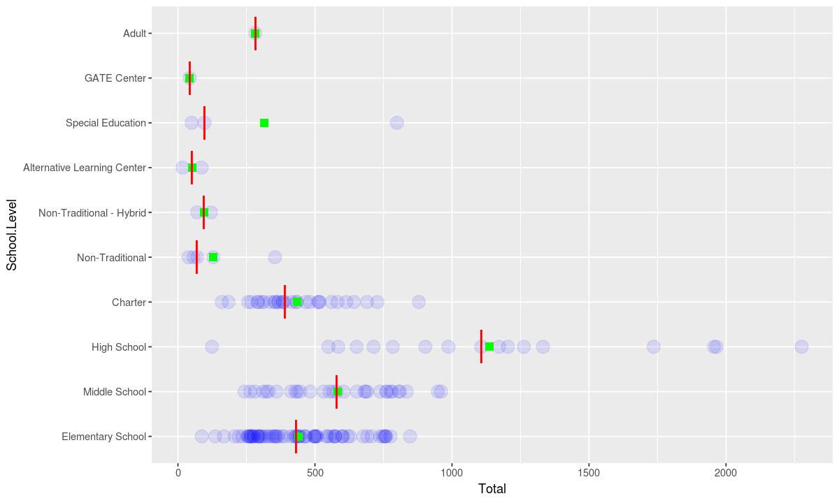
In the grammar of graphics, the number of geometries in a chart is not limited, so chart designers do not need to choose between using a point plot or a box plot.
ggplot(data, aesthetic) +
# include the box plot
geometry +
geom_point(stat = "identity", alpha=.1, size=5, color="blue") +
geom_point(stat = "summary", fun.y = "mean", size=3, shape="square", color="green") +
geom_point(stat = "summary", fun.y = "median", shape="|", size=10, color="red") +coord_flip()
Data Transformation
Sometimes it is necessary to reformat data for different visualizations.
In our original csv, each grade is a column, however to stack up counts from each grade we want to have each (school, grade) pair be a single row.
This way we can look at where each grade goes to school by aggregating on grade instead of school.
Let’s look at an example where we figure out how many students in each grade each school type serves.
# make a list of the columns that start with "Grade."
grade_names <- lapply(
    Filter(
        function(x) { startsWith(x, "Grade") },
        colnames(schools)), # go through each column
    function(x) { substring(x, nchar("Grade.")+1) })

# make a function that makes a (school, grade) row
getFrameForGrade <- function(grade_name) {
    # the coloumn name for this grade
    grade_col_name <- paste("Grade.", grade_name, sep="")
    # data on the school level, name, and number of students in this grade
    grade_counts <- data.frame(schools[ , c("School.Level", "School.Name", grade_col_name)])
    # make another column with the name of this grade
    grade_counts$Grade <- grade_name
    # rename the column with the number of students in this grade "Students"
    names(grade_counts)[names(grade_counts) == grade_col_name] <- "Students"
    # only include rows that have at least 1 student in this grade
    grade_counts <- grade_counts[complete.cases(grade_counts), ]
    # return the data frame slice
    return(grade_counts)
}

# concatenate the dataframe slices for each grade
grade_info <- Reduce(rbind, lapply(grade_names, getFrameForGrade))

# make sure the grades are plotted in the correct order
grade_info$Grade <- factor(grade_info$Grade, levels = grade_names)

head(grade_info)
| School.Level | School.Name | Students | Grade | |
|---|---|---|---|---|
| 3 | Elementary School | Amqui Elementary | 2 | PreK.3yrs |
| 4 | Elementary School | Andrew Jackson Elementary | 4 | PreK.3yrs |
| 9 | Elementary School | Bellshire Elementary | 15 | PreK.3yrs |
| 17 | Elementary School | Casa Azafran Early Learning Center | 11 | PreK.3yrs |
| 19 | Elementary School | Charlotte Park Elementary | 4 | PreK.3yrs |
| 20 | Elementary School | Cockrill Elementary | 3 | PreK.3yrs |
To double check that we got more than one grade let’s look at a summary
summary(grade_info)
            School.Level                              School.Name
 Elementary School:461   Harris-Hillman Special Education   : 15
 Charter          :139   Cora Howe School                   : 11
 Middle School    :124   East End Preparatory School        :  8
 High School      : 74   Johnson Alternative Learning Center:  8
 Special Education: 34   Murrell School                     :  8
 Non-Traditional  : 13   Stratford STEM Magnet School       :  8
 (Other)          : 23   (Other)                            :810
    Students            Grade
 Min.   :  1.00   2        : 84
 1st Qu.: 51.00   1        : 83
 Median : 85.00   3        : 83
 Mean   : 99.69   K        : 82
 3rd Qu.:125.25   4        : 82
 Max.   :598.00   PreK.4yrs: 65
                  (Other)  :389
Note that the schools that serve the most grades are special education schools, magnet schools and alternative learning centers, which matches what we would expect for American grade schools. The grades that are served by the most schools are the elementary school grades, which makes sense since our earlier charts showed that elemntary schools were smaller and more numerous than schools for older children.
Based on this evidence grade_info is probably correct.
Now let’s use our reformatted data to see which grades each school type serves
# use the grade_info as the data
data <- grade_info

# map grade to the x axis, the number of students to the y axis, use the fill color to indicate the school level
aesthetic <- aes(x=Grade, y=Students, fill=School.Level)

# use the bar chart geometry
geometry <- geom_bar(stat="sum", position = "stack")

# plot it
ggplot(data, aesthetic) + geometry + coord_flip()
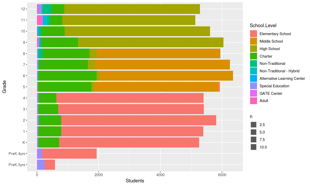
The chart above confirms that special education schools serve the largest number of grades. In general, public schools are divided into sets of four grades with elemntary school covering 1-4, middle school covering 5-8 and high school serving 9-12. However, some “middle schoolers” are in schools designated “high school” or “elementary school”. Middle schoolers are also more likely to attend charter schools than older and younger students.
Optional Elements
Charts, like sentences can have optional components which convey extra information or make the chart easier to understand. The optional elements for charts typically fall into the following categories:
Statistics
Representations to aid understanding
- descriptive
- mean
- median
- inferential
- confidence interval
- binning
- grouping
- bin shapes
- smoothing
- curve fitting
Coordinates
Space in which data is plotted
- coordinate systems
- cartesian
- polar
- spherical
- fixed
- fixed ratio between axes (such as latitude and longitude)
- limits
- edges of chart
Themes
Non-data ink
- labels
- call outs
- captions
- graphics
- icons
- font
Facets
Plotting small multiples
- subplots
- columns
- rows
Coordinates and Themes
The Multiple Geometries example above shows how statistics can be used to give context to a chart. In this example we will look at some of the other optional chart elements and how they can be used.
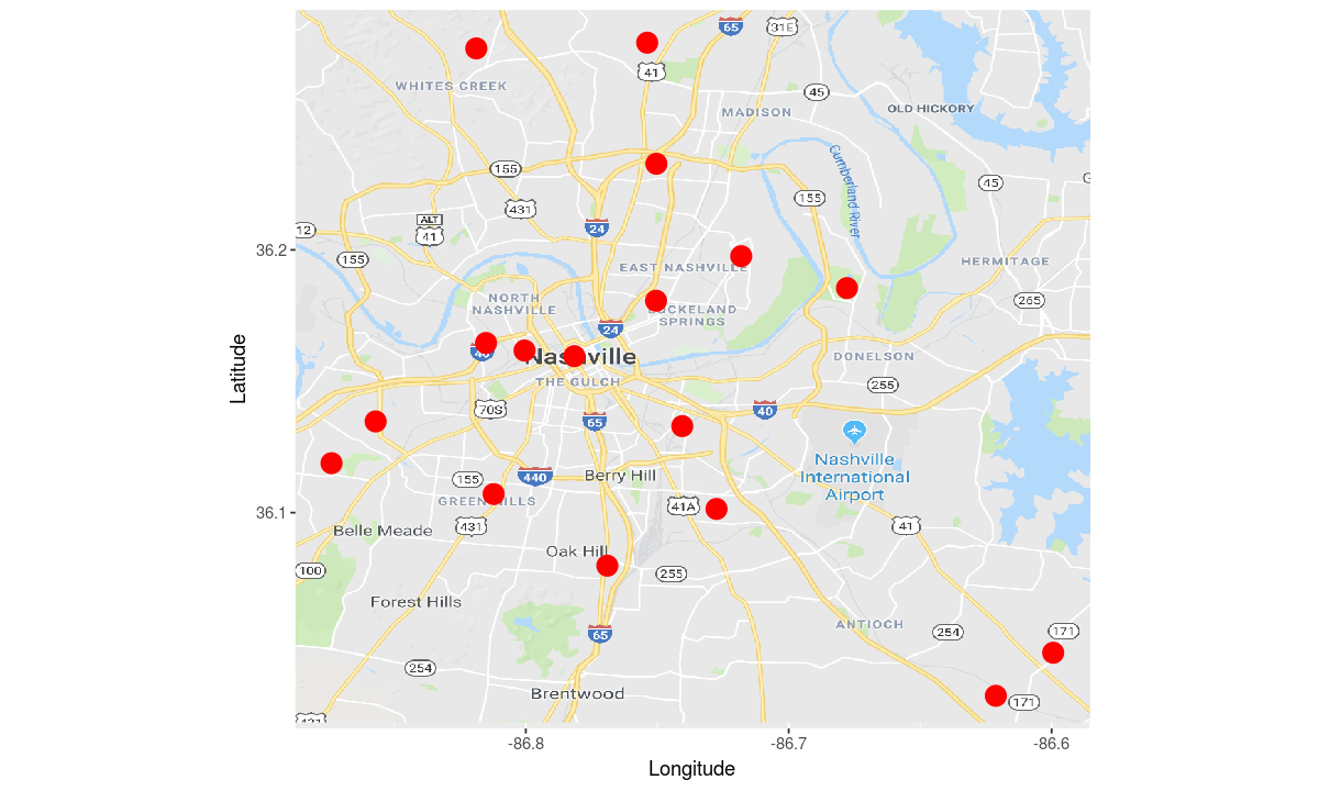
To start off with, let’s look at a bare bones plot of the locations of each high school.
# use the high schools as the data
data <- schools[schools$School.Level %in% c("High School"), ]

# map latitude to the y axis and longitude to the x axis
aesthetic <- aes(y=Latitude, x=Longitude)

# use a big red dot to indicate each high school
geometry <- geom_point(color="red", size=5)

# make the plot
ggplot(data, aesthetic) +
geometry
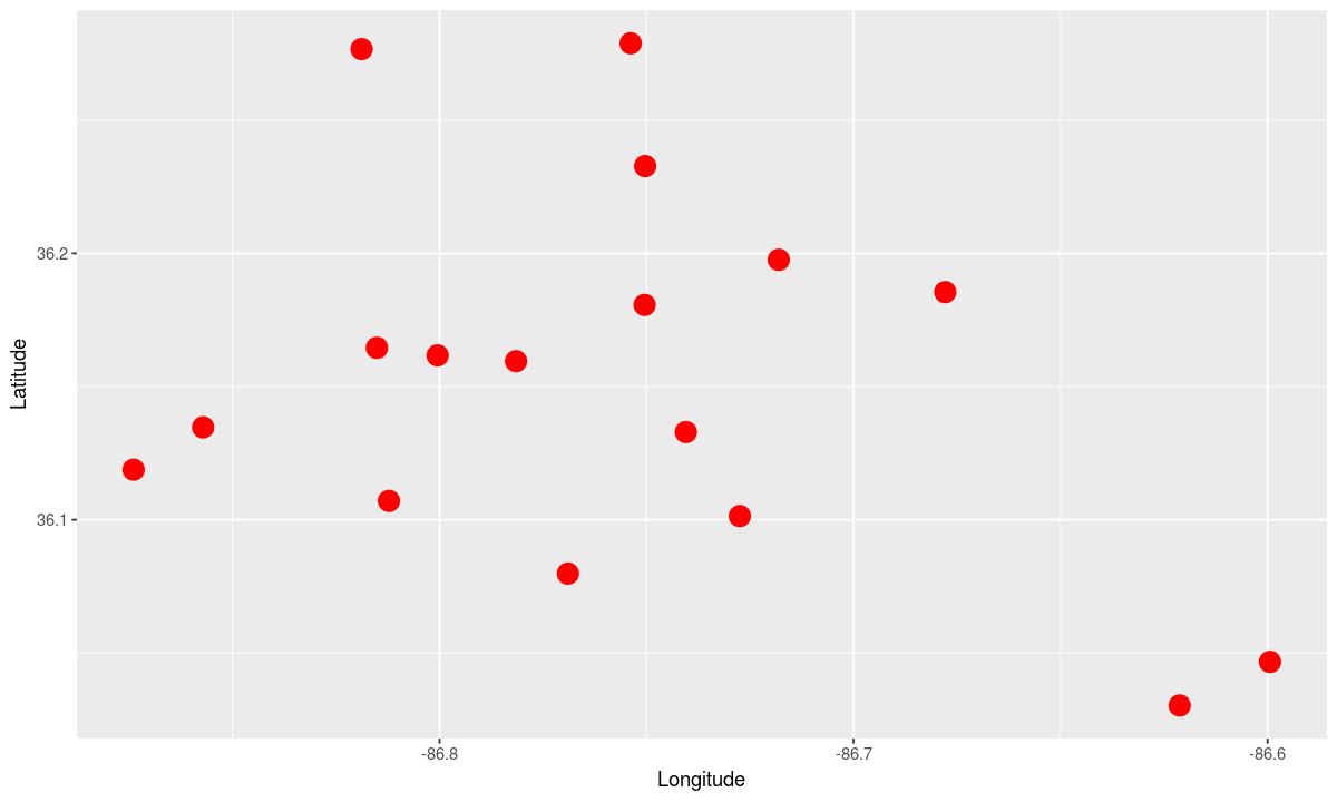
Note that the scale for longitude and latitude on our “map” is not the same, so this chart gives a warped view of which high schools are close to each other.
Let’s fix that by changing our coordinate system to a fixed one-to-one ratio
# fix the ratio between the x and y axis to be 1:1
coordinates <- coord_fixed(ratio=1)

ggplot(data, aesthetic) +
coordinates +
geometry
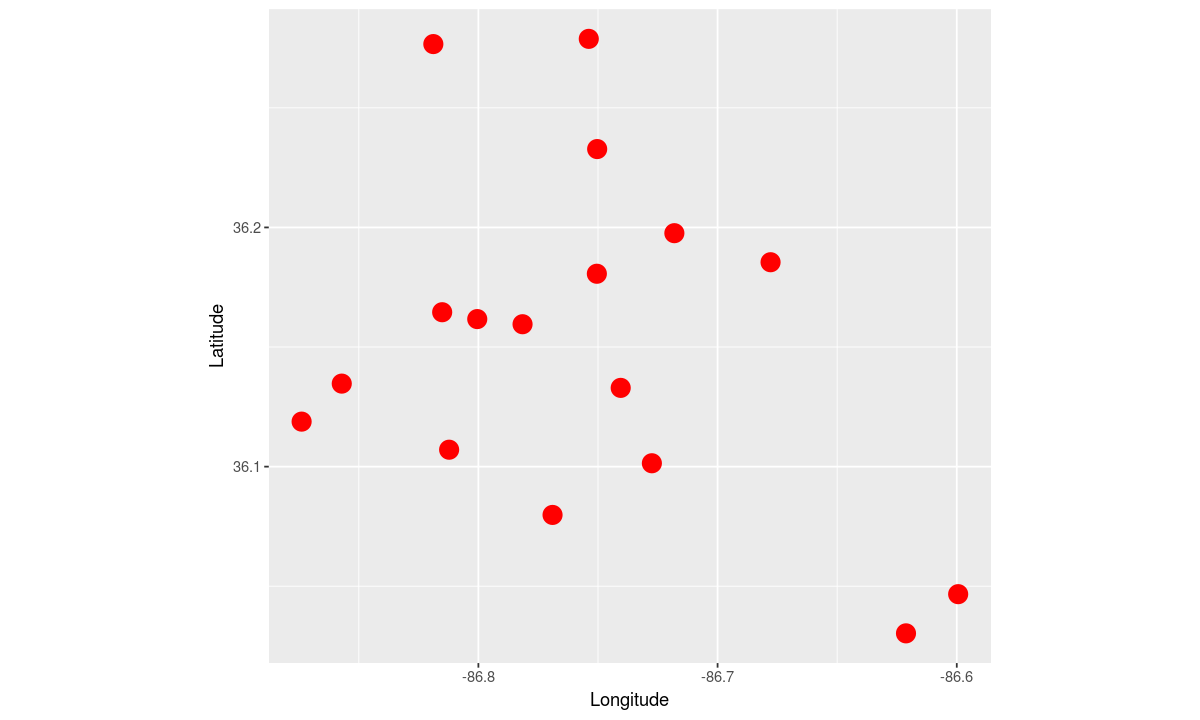
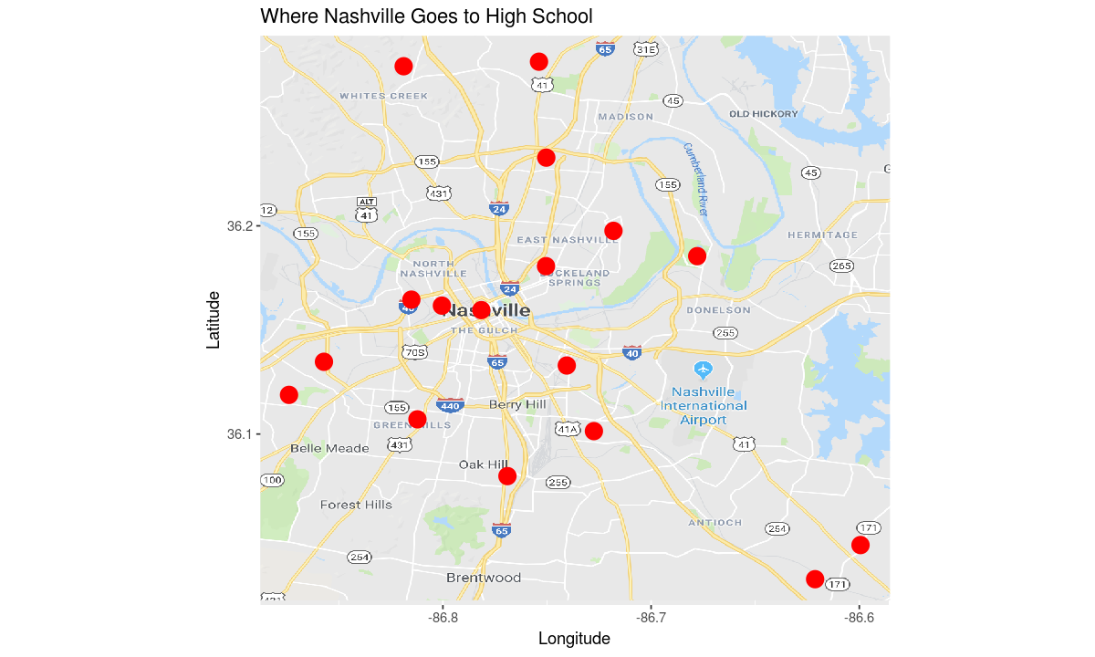
This map of high schools tells us where the high schools are relative to each other, but not where they are relative to major landmarks in Nashville.
Let’s add an image of a map of Nashville to give more context.
# load a map image and turn it into a geometry
# this image was created by taking a screen shot of Google Maps
# with the minimum and maximum latitude and longitude in the dataset
map_imp <- readPNG('nashville_map.png')

# add the map image to the plot
map_plot <- annotation_raster(map_imp,
                              ymin = min(schools$Latitude, na.rm=TRUE),
                              ymax= max(schools$Latitude, na.rm=TRUE),
                              xmin = min(schools$Longitude, na.rm=TRUE),
                              xmax = max(schools$Longitude, na.rm=TRUE))

# make the plot
ggplot(data, aesthetic) +
coordinates +
map_plot +
geometry
Finally, let’s add a title to the plot.
theme <- ggtitle("Where Nashville Goes to High School")

# make the plot
ggplot(data, aesthetic) +
map_plot +
coordinates +
theme +
geometry
Informative Map
Can we encode some more information on this map?
Let’s start by projecting the school level to the shape
# use all public schools as the data
data <- schools[schools$School.Level %in% c("Elementary School", "Middle School", "High School"), ]

aesthetic <- aes(
    y=Latitude,
    x=Longitude,
    # project school level to shape
    shape=School.Level)

# adjust the title to reflect that we are showing more schools
theme <- ggtitle("Where Nashville Goes to School")

# make the plot
ggplot(data, aesthetic) +
map_plot +
coordinates +
theme +
geometry
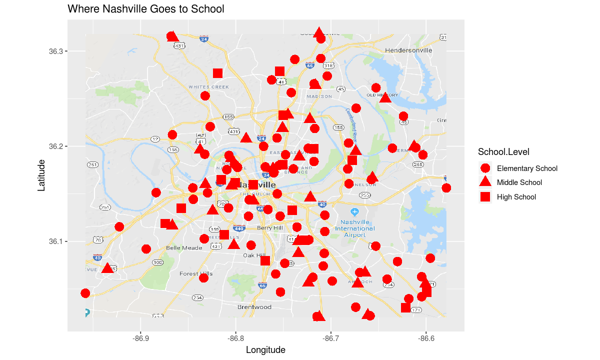
As we saw earlier, there are more elementary schools than middle or high schools
Now let’s use the size of each point to indicate the number of students at each school
aesthetic <- aes(
    y=Latitude,
    x=Longitude,
    shape=School.Level,
    # project school size to size
    size=Total)

# get rid of the size and color settings in the geometry,
# so data can be projected to these dimensions
geometry <- geom_point()

# make the plot
ggplot(data, aesthetic) +
map_plot +
coordinates +
theme +
geometry
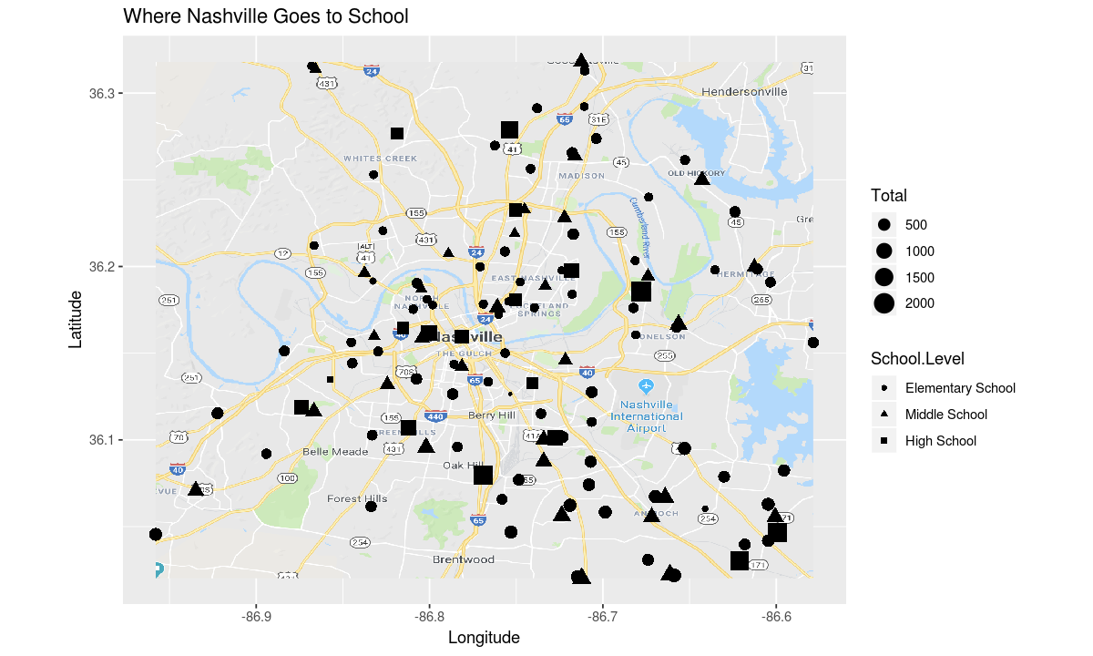
As we saw when making the Second Plot, the high schools in Nashville are generally larger than the elementary schools.
Finally let’s ask how segregated is Nashville. To answer this question let’s use the color of each point to display the percentage of students at each school who are white.
aesthetic <- aes(
    y=Latitude,
    x=Longitude,
    shape=School.Level,
    size=Total,
    # project percentage of students who are white to color
    color=White/Total)

# adjust the title to reflect the question we are asking
theme <- ggtitle("How segregated is Nashville?")

# make the plot
ggplot(data, aesthetic) +
map_plot +
coordinates +
theme +
geometry
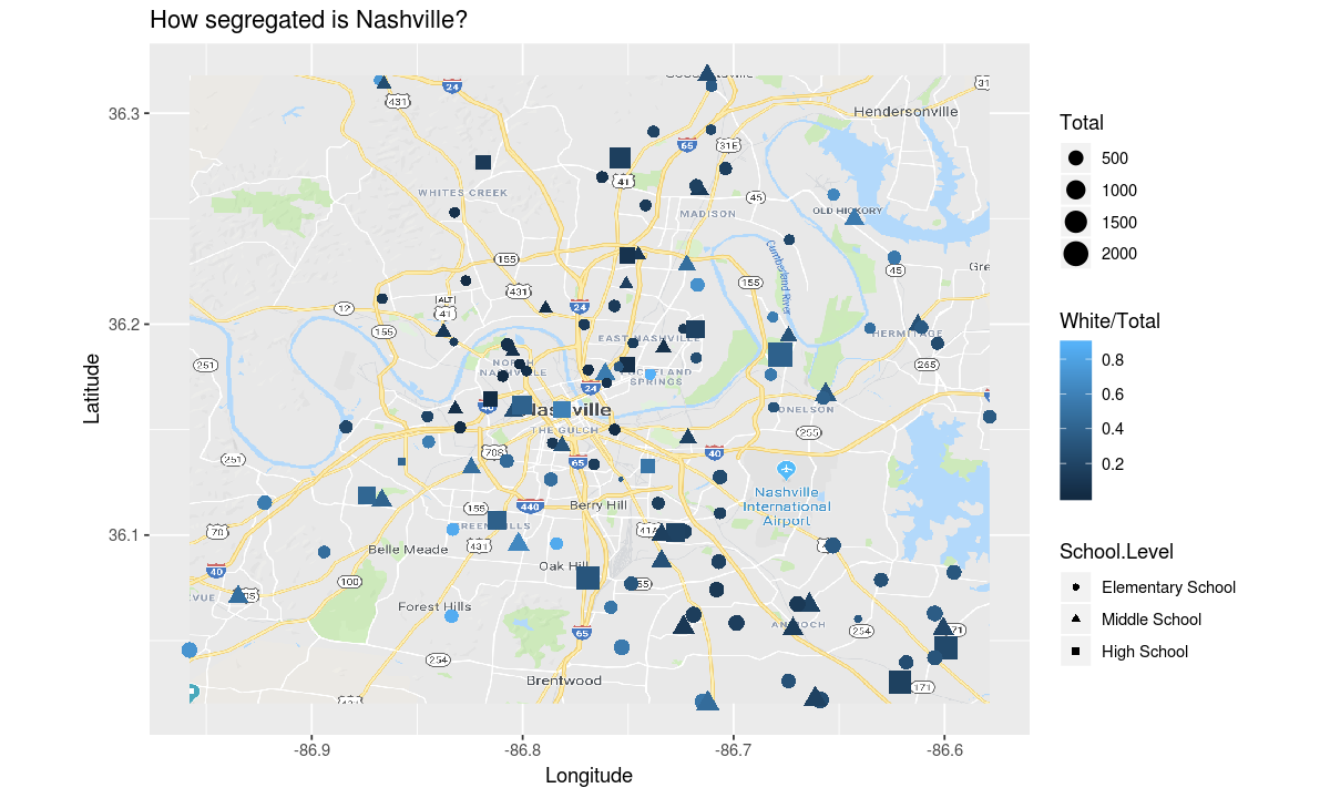
This map is hard to read because the light blue color indicating a school is mostly white students is very close to the color for water in our map image.
Let’s use a color scale that doesn’t use any of the colors in our map.
ggplot(data, aesthetic) +
map_plot +
coordinates +
# change the color scale
scale_colour_gradient(low = "blue", high = "red") +
theme +
geometry
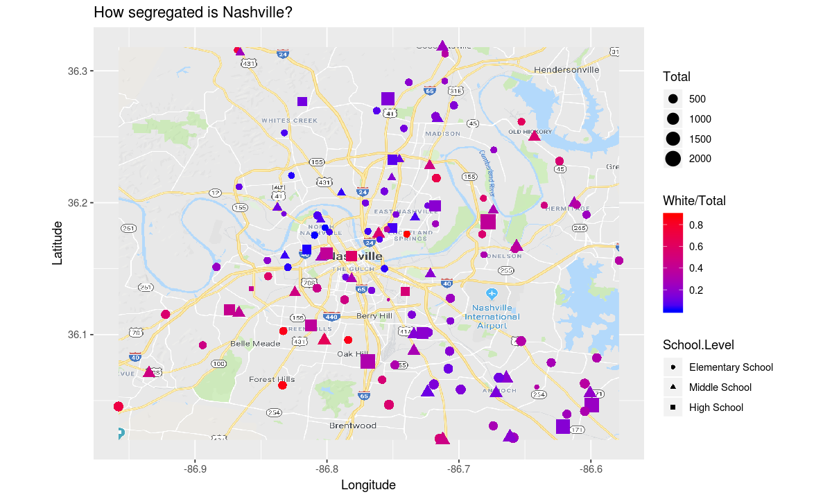
It appears that white students in Nashville are concentrated in the southwest and east. Are the other ethnicities in our dataset just as segregated?
build_plot_for_race <- function(race_name) {
    aesthetic <- aes(
    y=Latitude,
    x=Longitude,
    shape=School.Level,
    size=Total,
    # project percentage of students who are race_name to color
    color=get(race_name)/Total)

    # adjust the title to reflect the question we are asking
    theme <- ggtitle(paste("How segregated are", race_name, "students in Nashville?"))

    # set the legend label for color correctly
    labels <- labs(color=paste("Fraction", race_name, "students"))

    ggplot(data, aesthetic) +
    map_plot +
    coordinates +
    scale_colour_gradient(low = "blue", high = "red") +
    theme +
    labels +
    geometry
}

build_plot_for_race("Black.or.African.American")
build_plot_for_race("Hispanic.Latino")
build_plot_for_race("Asian")
build_plot_for_race("Native.Hawaiian.or.Other.Pacific.Islander")
build_plot_for_race("American.Indian.or.Alaska.Native")
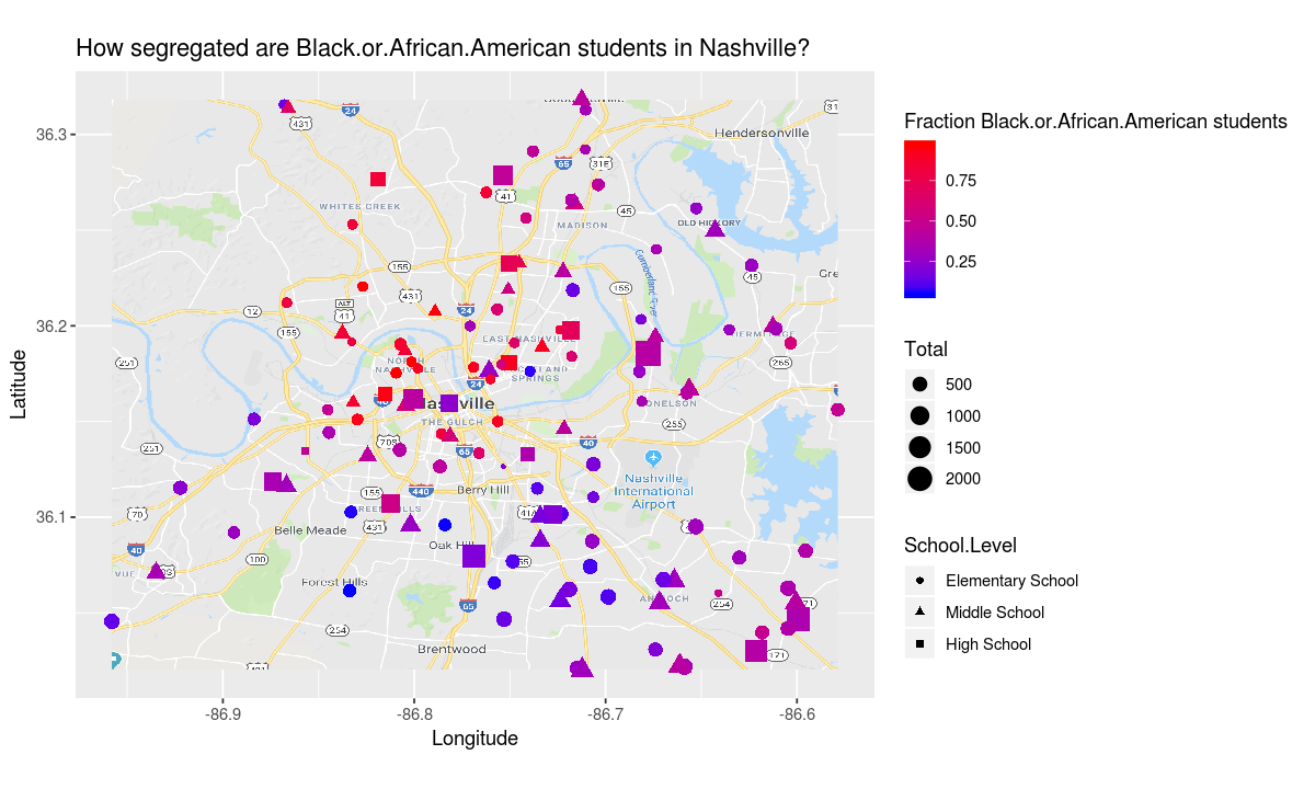
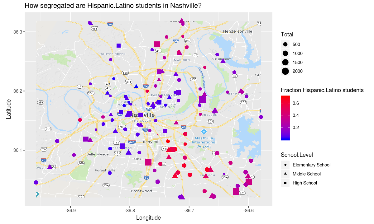
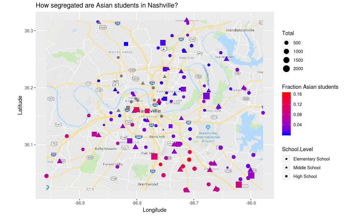
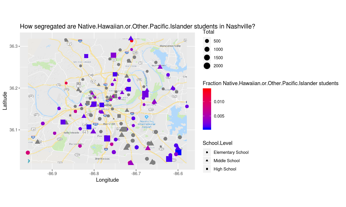
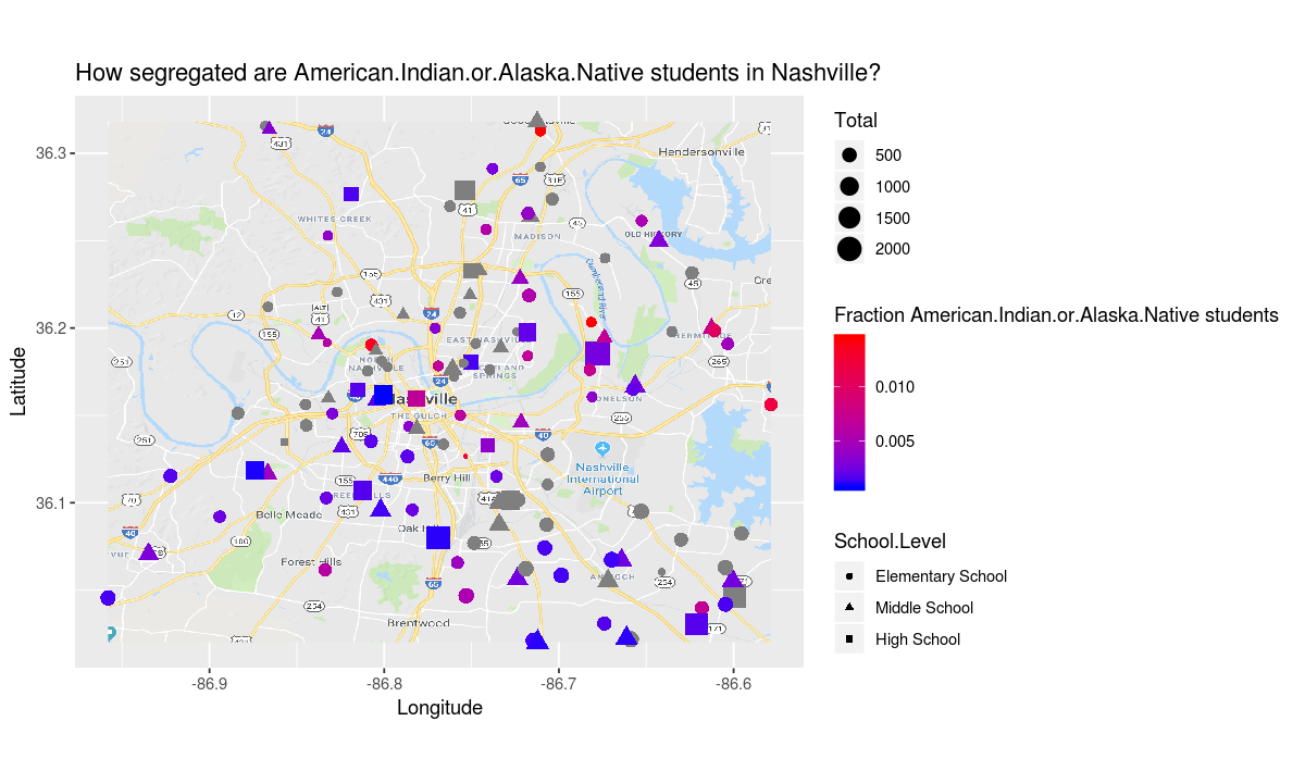
The african american and latinx students appear to have an even more segregated school experience than the white students.
Facet Example
Looking over the map for white students, it appears that while there are several elementary schools that have 80% white students or more, middle and high schools are more integrated.
Are white students more segregated in elementary school than high school?
To answer this question, we need to reformat the data so we have one row per (school, race) pair.
race_names <- c(
    "White",
    "Black.or.African.American",
    "Hispanic.Latino",
    "Asian",
    "Native.Hawaiian.or.Other.Pacific.Islander",
    "American.Indian.or.Alaska.Native"
)

# get the data for a given race
getFrameForRace <- function(race_name) {
    race_counts <- data.frame(schools[ , c("School.Level", "School.Name", "School.ID", race_name, "Total")])
    race_counts$Race <- race_name
    # fraction of students at school who are this race
    race_counts$Fraction <- race_counts[ , race_name]/race_counts$Total
    names(race_counts)[names(race_counts) == race_name] <- "Students"
    race_counts <- race_counts[complete.cases(race_counts), ]
    return(race_counts)
}

# concatenate the data for all races
race_info <- Reduce(rbind, lapply(race_names, getFrameForRace))

# make sure the grades are plotted in the correct order
race_info$Race <- factor(race_info$Race, levels = race_names)

# order schools by fraction of <race_to_order_by> students
race_to_order_by <- "White"
school_names <- schools[,c("School.Name", race_to_order_by, "Total")]
school_names$Fraction <- school_names[,race_to_order_by]/school_names$Total
school_names <- school_names[order(-school_names[, "Fraction"]), ]
school_names <- school_names$School.Name

race_info$School.Name <- factor(race_info$School.Name, levels = school_names)

# order races
race_info$Race <- factor(race_info$Race, levels = race_names)

head(race_info)
| School.Level | School.Name | School.ID | Students | Total | Race | Fraction |
|---|---|---|---|---|---|---|
| Elementary School | A. Z. Kelley Elementary | 496 | 218 | 847 | White | 0.25737898 |
| Elementary School | Alex Green Elementary | 375 | 15 | 266 | White | 0.05639098 |
| Elementary School | Amqui Elementary | 105 | 73 | 464 | White | 0.15732759 |
| Elementary School | Andrew Jackson Elementary | 460 | 270 | 502 | White | 0.53784861 |
| High School | Antioch High School | 110 | 442 | 1956 | White | 0.22597137 |
| Middle School | Antioch Middle | 111 | 112 | 782 | White | 0.14322251 |
Let’s look at a summary of the new race_info frame to make sure it looks right
summary(race_info)
            School.Level                           School.Name    School.ID
 Elementary School:373   Percy Priest Elementary         :  6   Min.   :100.0
 Middle School    :154   Julia Green Elementary          :  6   1st Qu.:296.0
 Charter          :142   Harpeth Valley Elementary       :  6   Median :496.5
 High School      : 91   Dan Mills Elementary            :  6   Mean   :462.3
 Non-Traditional  : 20   John Trotwood Moore Middle      :  6   3rd Qu.:613.5
 Special Education: 13   Harris-Hillman Special Education:  6   Max.   :805.0
 (Other)          : 23   (Other)                         :780
    Students       Total                                             Race
 Min.   :  1   Min.   :  17   White                                    :169
 1st Qu.:  4   1st Qu.: 313   Black.or.African.American                :169
 Median : 44   Median : 467   Hispanic.Latino                          :169
 Mean   :106   Mean   : 539   Asian                                    :146
 3rd Qu.:164   3rd Qu.: 685   Native.Hawaiian.or.Other.Pacific.Islander: 68
 Max.   :914   Max.   :2276   American.Indian.or.Alaska.Native         : 95

    Fraction
 Min.   :0.0005112
 1st Qu.:0.0123767
 Median :0.1061686
 Mean   :0.2071063
 3rd Qu.:0.3396043
 Max.   :0.9742765
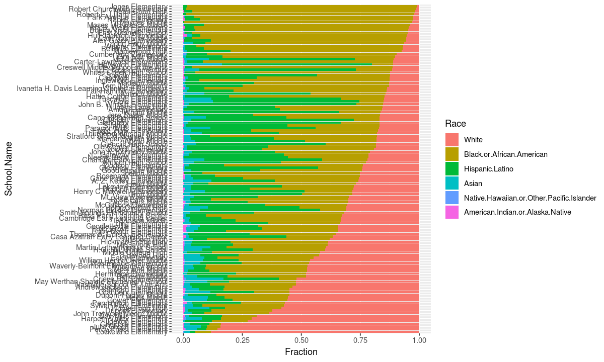
When we defined race_info we made the default ordering of the schools correspond to the percentage of their students who are white. Let’s look at all the schools as stacked bar charts to see the variance in how many white students they have.
# only look at schools that are elmentary, middle, or high schools
data <- race_info[race_info$School.Level %in% c("Elementary School", "Middle School", "High School"), ]

# use a stacked bar chart to show which fractions of students in a school are each race
aesthetic <- aes(x=School.Name, y=Fraction, fill=Race)
geometry <- geom_bar(stat="identity", position="stack")

ggplot(data, aesthetic) + geometry +
#  flip the coordinates so each school is a row not a column
coord_flip()
The names of each school don’t give much information since we are interested in trends among school types, not the values for individual schools, so let’s use the theme to get rid of the school name labels.
# delete school name labels
theme <- theme(axis.title.y=element_blank(),
        axis.text.y=element_blank(),
        axis.ticks.y=element_blank())

ggplot(data, aesthetic) + geometry +
theme +
coord_flip()
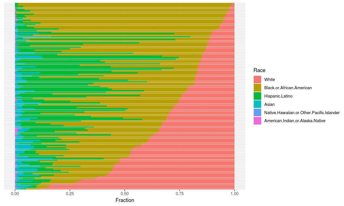
This chart tells us that there is a lot of variance in the percentage of students who are white in schools, but doesn’t tell us how that information corresponds to the type of school.
Let’s use a facet to plot each school type on a different subplot.
ggplot(data, aesthetic) + geometry +
# make different facets based on school level
facet_grid( ~ School.Level) +
theme +
coord_flip()
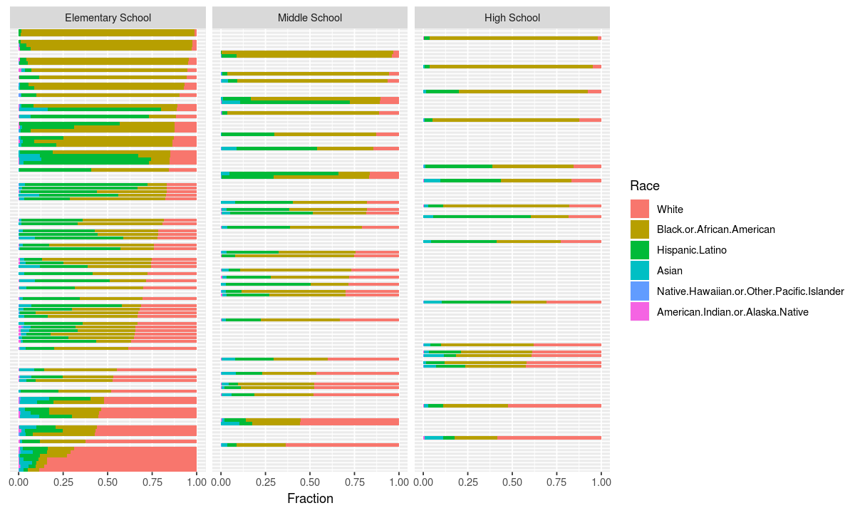
This chart shows that the whitest schools are elementary schools and high schools tend to be more integrated.
However, it does not tell us whether the super white elementary schools actually serve a lot of students, so let’s use the width dimension to see what the population at each school is.
# project school population to width (divide the total by 2000 so bars don't overlap)
aesthetic <- aes(x=School.Name, y=Fraction, fill=Race, width=Total/2000)

ggplot(data, aesthetic) + geometry +
facet_grid( ~ School.Level) +
theme +
coord_flip()
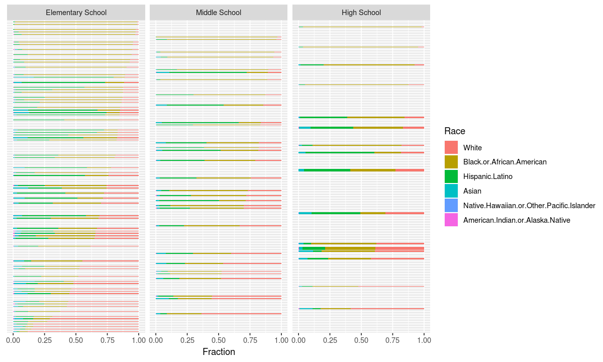
Now we can see that the super white elementary schools are not all super small, so our hypothesis that white students have a more integrated experience as they get older appears correct.
Do black students experience more integrated education as they get older?
To answer this question, let’s re-order the schools by the percentage of african american students in each
# re-order schools by fraction of <race_to_order_by> students
race_to_order_by <- "Black.or.African.American"
school_names <- schools[,c("School.Name", race_to_order_by, "Total")]
school_names$Fraction <- school_names[,race_to_order_by]/school_names$Total
school_names <- school_names[order(-school_names[, "Fraction"]), ]
school_names <- school_names$School.Name

race_info$School.Name <- factor(race_info$School.Name, levels = school_names)
Now let’s re-generate the chart with the new school ordering
# assign the data to the re-ordered set
data <- race_info[race_info$School.Level %in% c("Elementary School", "Middle School", "High School"), ]

ggplot(data, aesthetic) + geometry +
facet_grid( ~ School.Level) +
theme +
coord_flip()
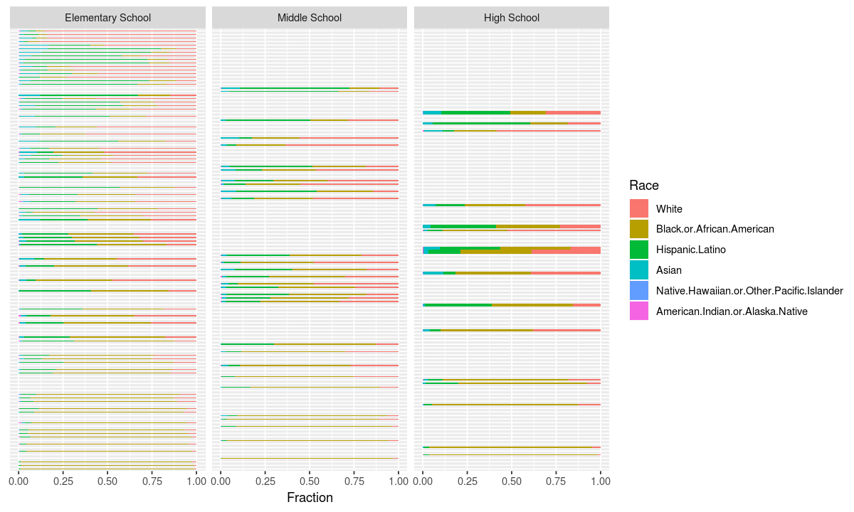
Here we see that while the schools with the most african american students are elemntary schools, the most segregated high schools aren’t far behind. Unlike white students, many black students may find that they are surrounded by more students with their same skin color as they get older.
Closing Thoughts
Even if you don’t use R, the Grammar of Graphics is a useful framework for thinking about how to construct visualizations. The links presented in the introduction are great for getting inspiration and learning about visualization theory.
A lot of studies have been done on how accurately humans can read information encoded in various ways, such as color, length and angle. When building graphs, try to put the most important information on the easiest to read axis.