Visualizing Everything In Python
Introduction
This blog post is based on a talk I gave at PyTennessee. There is a github repository with instructions on how to run a jupyter notebook that contains all examples discussed here.
This tutorial covers methods of performing several visualization techniques in Python with a particular focus on exploratory research and data cleaning. It uses a dataset of Stack Overflow posts from the first two weeks of September 2017 compiled from the Stack Exchange Data Explorer. Location information was added using the Google Maps API. I like this dataset because, in addition to being interesting to developers, it contains numerical, text, time series and geographic data.
Many great tutorials on data visualization are written by statisticians and focus almost exclusively on numerical and categorical data. While these tutorials are useful, and data is often in a simple numerical or categorical form by the time it has been cleaned up for publication, uncleaned data often takes on many other forms. By not discussing how to visualize other forms of data, practitioners can give the impression that visualization cannot be done with complex data types and shouldn’t be done with unclean data. Nothing could be further from the truth. The value of visualizations is at its highest during the exploratory phase, since this is when a researcher is most likely to overlook important information. Thus, this tutorial focuses on how visualization can assist exploratory research and data cleaning.
After loading the libraries and data, I will examine how complete the data is using missingno. In this section, I will look at how the data can be partitioned and track down some anomalies on Stack Overflow’s website. As part of this section, the bar charting capabilities of Pandas and Bokeh are used.
The next section will concentrate on visualizing text from the question titles. This section will begin by using the bag of words model to make a bar chart and heatmap. I will then discuss the shortcomings of this model and go over word trees using Pydotplus.
The fourth section looks at what the data says about the time of each post. First, I will make a histogram of the hour of the day each post was created. Next, I will look at how many minutes passed between when a question was posted and when it was answered. I will look briefly at the anomalies this shows us, and at how box plots allow us to compare latency distributions using Seaborn.
The fifth section looks at the network of users answering each other’s questions. I model this network by drawing an edge from each user who answered a question to the person they answered. Pydotplus is used to visualize how connected this graph is and the different roles taken on by different users.
The final section deals with the self reported location data from Stack Overflow. This section will go through a few example visualizations with this data, and talk about why geo-spatial data is hard to work with. I will use Bokeh to make the example visualizations.
I will finish this presentation with a short conclusion. There are many libraries for visualization in Python that this talk does not touch on. Hopefully the examples here will give readers the vocabulary to find other libraries and experiment on their own. The main points I’m hoping participants come away with are:
- Visualize early - Making visualizations early on can help a lot with data cleaning
- Visualize for yourself first - Visualization is a powerful tool for showing you what is going on in your data and if you can’t understand your own visualizations, no one else will
- Barcharts are awesome, but not everything should be a barchart - Wordtrees, network diagrams and heatmaps are also nice
- You can do it - You know python and therefore can make any chart you want. If a library doesn’t already exist to do what you want, I’d appreciate if you’d make one.
Table of Contents
- Introduction
- Load the Libraries
- Load the Data
- Visualizations
- Conclusion
Make sure to go through the first two sections (data and completeness) first. The other sections can be done out of order.
Load Libraries
DownloadsZ
If you’d like to download all necessary data used in this tutorial you can do so at the following links.
The bokeh sample data can be downloaded by running the following code in python
import bokeh.sampledata as sampledata
sampledata.download()
Below are all the libraries which are necessary for this tutorial
# General purpose libraries

# A nice library for reading in csv data
import pandas as pd
# A library which most visualization libraries in Python are built on.
# We will start by using it to make some plots with pandas
%matplotlib inline
import matplotlib.pyplot as plt
# A library for doing math
import numpy as np
# A library for turning unicode fields into ASCII fields
import unicodedata
# a regex library
import re
# a class which makes counting the number of times something occurs in a list easier
from collections import Counter

#---------------------#

# some functions for displaying html in a notebook
from IPython.core.display import display, HTML

# A library to visualize holes in a dataset
import missingno as msno

# a fancy library for numerical plots
import seaborn as sns

#---------------------#

# Libraries for Word Trees

# lets us use graphviz in python
from pydotplus import graphviz
# to display the final Image
from IPython.display import Image

#---------------------#

# Libraries for interactive charts

from bokeh.io import output_notebook
# display interactive charts inline
output_notebook()
from bokeh.palettes import Viridis6 as palette
from bokeh.plotting import figure, show
from bokeh.models import
  HoverTool,
  ColorBar,
  LinearColorMapper,
  FixedTicker,
  ColumnDataSource,
  LogColorMapper
# to make patches into glyphs and treat counties and states differently
from bokeh.models.glyphs import Patches
The following import is a pair of shape files we use for making maps. If you haven’t downloaded these shape files previously, you will need to run bokeh.sampledata.download(), hence the try statement.
If you don’t want to download these files, you will miss out on part of the mapping section at the end of this tutorial, but otherwise the tutorial will be unaffected.
try:
    # shape files for US counties
    from bokeh.sampledata.us_counties import data as counties
    # shape files for US states
    from bokeh.sampledata import us_states as us_states_data
except RuntimeError as e:
    # comment these two lines out if you have previously run them
    import bokeh.sampledata as sampledata
    sampledata.download()

    # shape files for US counties
    from bokeh.sampledata.us_counties import data as counties
    # shape files for US states
    from bokeh.sampledata import us_states as us_states_data
Load the Data
Our data is Stack Overflow posts from the first 14 days of September 2017.
The data was compiled from searches on the Stack Exchange Data Explorer.
It is being stored on Google Drive.
url = 'https://docs.google.com/spreadsheets/d/1Uz3F_jCNHTo84k1jVQGGa_n_ZQpBUNKyI0ij6Bc3AlM/export?format=csv'
#url = '<your-path>' # uncomment this line and set the path if you have downloaded the data locally

# load the data
posts = pd.read_csv(url)
posts.head()
| PostId | Score | PostType | CreationDate | Title | UserId | Reputation | Location | Tags | QuestionId | |
|---|---|---|---|---|---|---|---|---|---|---|
| 0 | 46009270 | 0 | Question | 2017-09-02 0:00:07 | Android: AlarmManager running every 24h - is i... | 8281994.0 | 173.0 | Germany | <android><alarmmanager> | NaN |
| 1 | 46009271 | 0 | Answer | 2017-09-02 0:00:22 | NaN | 1812182.0 | 1641.0 | Canary Islands, Spain | NaN | 45947723.0 |
| 2 | 46009275 | 1 | Answer | 2017-09-02 0:00:42 | NaN | 8549754.0 | 21.0 | NaN | NaN | 46007409.0 |
| 3 | 46009276 | 1 | Answer | 2017-09-02 0:00:47 | NaN | 2478398.0 | 793.0 | NaN | NaN | 46009169.0 |
| 4 | 46009273 | 0 | Answer | 2017-09-02 0:00:36 | NaN | 5465303.0 | 87.0 | Ann Arbor, MI, United States | NaN | 46008023.0 |
Fields in the data
Each row in this dataset contains 10 columns:
- PostId - the id in Stack Overflow’s database of this post
- Score - the score given to the post by people voting up and down on it
- PostType - What type of post is this?
- CreationDate - When was this post posted?
- Title - The text in the title of the post
- UserId - The id of the user who posted in the Stack Overflow database
- Reputation - The reputation of the user who posted
- Location - The location the user put down as their home on their profile
- Tags - Tags which are associated with this post
- QuestionId - The question this post is linked to
Let us convert CreationDate to a datetime type
posts['CreationDate'] = pd.to_datetime(posts['CreationDate'])
Visualizing Completeness
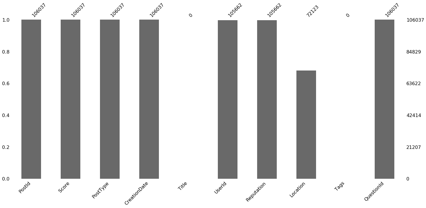
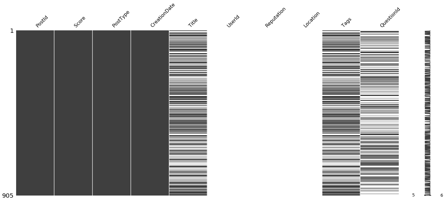
I’d like to know how complete our data is, so let’s look at which fields have null values for the answers and questions using missingno.
Black indicates that the data is present while white indicates that it is missing. The column on the far right is meant to show a chart of how many variables each data point has. It is a bit hard to see on a dataset this large, but if you change the command to msno.matrix(posts.sample(100)) it will make more sense.
msno.matrix(posts)
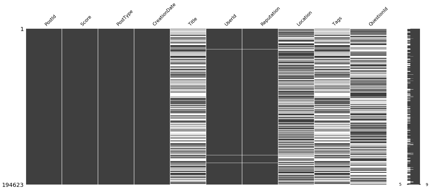
Is there any correlation between when columns are null? Why don’t we have a single row which is complete in all 10 columns?
Missingno has a lot of ways of visualizing data completeness. One of them is to see the correlation in missing-ness between fields. It does this by generating a heatmap where blue indicates two fields tend to go missing together and red indicates two fields tend to be mutually exclusive. Fields which are always present are excluded from the heatmap, and correlations below 0.1 are grayed out.
What is the correlation between missing columns?
msno.heatmap(posts)
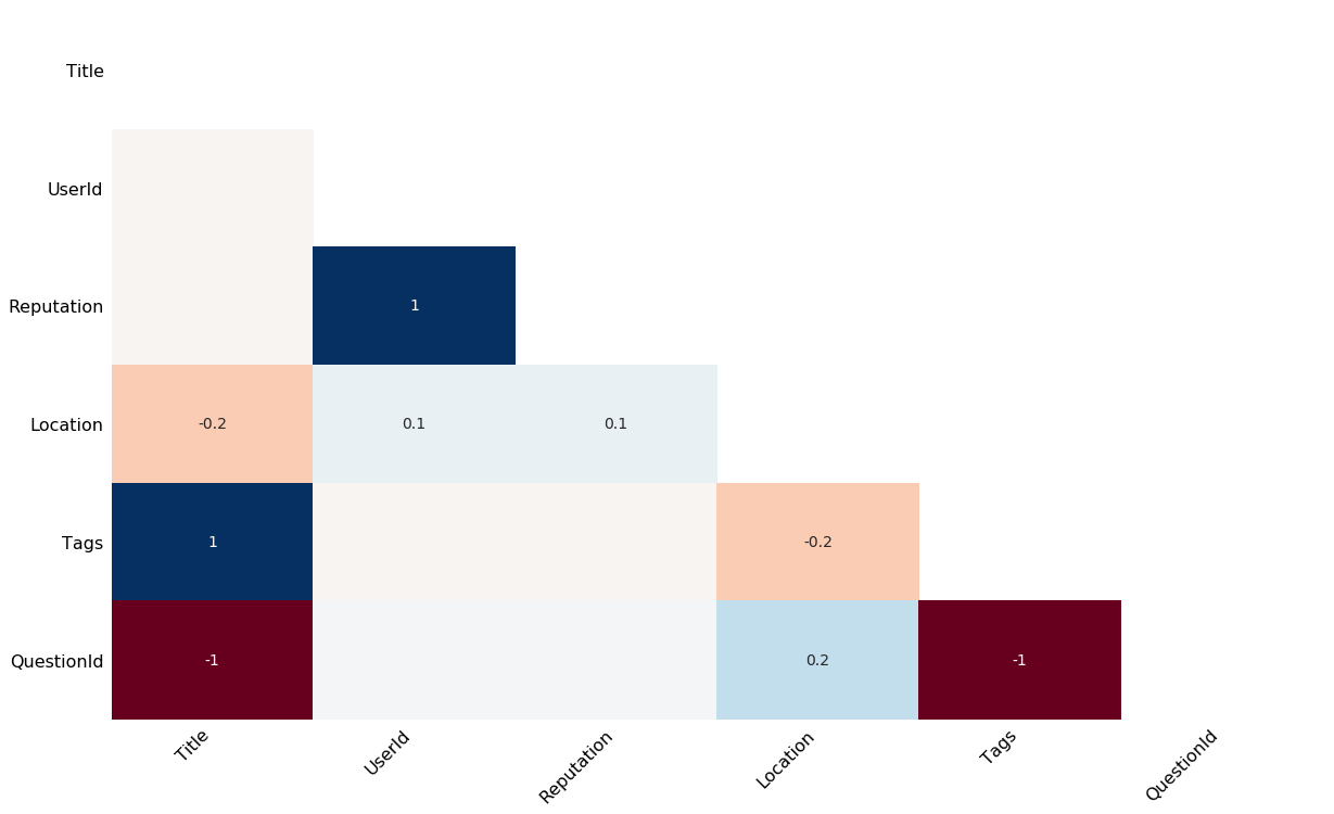
Notice that posts with title information always have tag information and never have a question id.
I wonder if these groups make up different types of posts. Let’s investigate which post types we have.
post_type_counts = posts['PostType'].value_counts()
post_type_counts.plot(kind='bar', color='DarkBlue') # use color or each bar will be colored differently
plt.show()
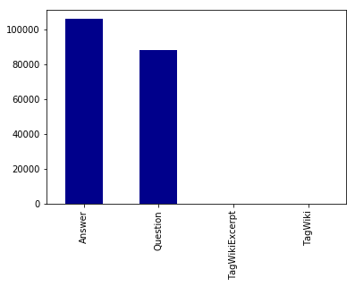
Is there a way to make this chart interactive so we can see how many “TagWiki”s and “TagWikiExcerpt”s there are?
Let’s use Bokeh.
In markdown this chart is not interactive, but if you run the code in python, Bokeh will make an DOM element that is interactive.
TOOLS = "pan,wheel_zoom,reset,hover,save"

p = figure(
    title="Post Types",
    tools=TOOLS,
    x_range=post_type_counts.index.tolist(),
#     y_axis_type="log",
    plot_height=400
)
p.vbar(x=post_type_counts.index.values, top=post_type_counts.values, width=0.9)

hover = p.select_one(HoverTool)
hover.point_policy = "follow_mouse"
hover.tooltips = [("Number of Posts", "@top")]

show(p)

Most posts are either questions or answers. These types of posts serve very different purposes, so let’s separate them out and see how complete each is.
This time we’ll try a different method of visualizing missing data in which we count up how often each attribute is not missing.
questions = posts[posts['PostType'] == 'Question']

print("Questions")
msno.bar(questions)
Questions
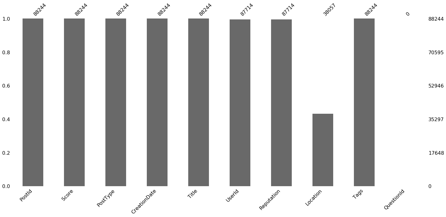
answers = posts[posts['PostType'] == 'Answer']

print("Answers")
msno.bar(answers)
Answers
Notice that UserId is missing for 1,171 questions and 785 answers. This is only .4% of the data overall, but it seems strange that a post can exist without a user to make it.
Usually, when you find out that you having missing data you want to know why and what is going on with those points. Fortunately Pandas makes this very easy.
null_user_id_posts = posts[posts['UserId'].isnull()]
msno.matrix(null_user_id_posts)
If we want to view these posts, we can see questions and answers with null UserIds using Jupyter’s HTML capabilities. The following code creates links we can click on to see each post on Stack Overflow.
Compare the user descriptions for the linked posts to the user descriptions for other posts on the webpage.
# a function to turn a post into a link to that post on stackoverflow.com
def get_link(p, desc='has no UserId'):
    # the link to a post is different for answers and questions
    if p['PostType'] == 'Answer':
        link = '"https://stackoverflow.com/questions/{0}#answer-{1}"'.format(int(p['QuestionId']), int(p['PostId']))
    else:
        link = '"https://stackoverflow.com/questions/{0}"'.format(int(p['PostId']))
    return '<a href='+link+' target="_blank">{2} {0} {1}</a>'.format(int(p['PostId']), desc, p['PostType'])

# Take the first couple posts without user ids, turn them into links
# join those links with the <br/> tag, and display the result as HTML
null_user_id_links = null_user_id_posts.head().apply(lambda p: get_link(p), axis=1)
display(HTML('<br/>'.join(null_user_id_links)))
Question 46018645 has no UserId
Question 46014700 has no UserId
Question 46016644 has no UserId
Question 46014745 has no UserId
Answer 46012773 has no UserId
Did you notice that unlike other user descriptions, the users of the linked posts had no link to their profile page and no information about their reputation. My theory is that these users deleted their accounts.
Text Visualization
How can we visualize text in the titles of each post?
One method is to count the frequency that a word is used and make statistical charts with pandas and seaborn.
Let’s look at the frequencies of the 50 most common words in posts tagged ‘python’.
There are some words which appear a lot more than any others in any body of text. These are commonly referred to as “stop words” and they rarely give any information about a document when that document is modeled as a bag of words. For this reason, it is best to ignore these words when looking at the most common words. To do this we need a stop word list. Fortunately Alireza Savand maintains lists of stop words in several languages on Github. For this tutorial we will just read in the English list from Github, but if you want you can install his library for python. More sophisticated readers who want to dive into text processing should check out the NLTK library.
# get posts tagged 'python'
tag = 'python'
python_titles = questions[questions['Tags'].str.contains('<'+tag+'>')]['Title'].str.lower()
# Use a counter to find the most frequent words
word_counter = Counter([word for phrase in python_titles.tolist() for word in re.split("[^\w]+", phrase)])

# get frequent words without much meaning (stop words) for English
url = 'https://raw.githubusercontent.com/Alir3z4/stop-words/master/english.txt'
# url = '<your-path>' # uncomment this line and add the path if you have downloaded the English stop words
stop_words = pd.read_csv(url, header=None)[0].tolist()
Now that we have a list of stop words, let’s filter them out of our list of common words.
stop_word_count = 0
words_to_use = 50

# a list to collect words in the top 50 that are not stop words
totals = []
# a dataframe to occur whether or not a word appears in each post title
occurs_in_post = pd.DataFrame()
for word, count in word_counter.most_common(words_to_use):
    # also filter out the empty string
    if word in stop_words or len(word) == 0:
        stop_word_count += 1
        continue
    totals.append((word, count))
    occurs_in_post[word] = python_titles.apply(lambda s: 1 if word in re.split("[^\w]+", s) else 0)

print('{0} of the top {1} words were stop words'.format(stop_word_count, words_to_use))
23 of the top 50 words were stop words
Now that we have a list of words that are common but not stop words, let’s plot their frequencies.
# plot word counts
totals = pd.DataFrame(totals, columns=['word', 'count'])
totals.set_index('word', inplace=True)
totals.plot(kind='bar')
plt.show()
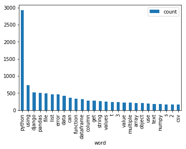
Notice that users tend to write python in the title of their question in addition to tagging with the label python.
Words do not occur independently of each other. In addition to counting how often each word appears we can also visualize the co-appearance of words. Seaborn makes this very easy.
# get the correlation between word occurances
corr = occurs_in_post.corr()

# Generate a mask for the diagonal
mask = np.zeros_like(corr, dtype=np.bool)
diagonal_index = np.diag_indices(len(mask))
mask[diagonal_index] = True

# get the maximum value not on the diagonal
corr_values = corr.values.copy()
corr_values[diagonal_index] = 0
corr_values = [val for row in corr_values for val in row]
max_corr = max(corr_values)

sns.clustermap(corr, mask=mask, cmap="BrBG", vmax=max_corr, center=0)
plt.show()
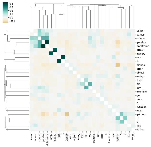
Notice that ‘value’, ‘values’, ‘column’, ‘pandas’ and ‘dataframe’ frequently co-occur. ‘Django’ and ‘Python’ usually do not appear in the same question title. ‘Array’ and ‘numpy’ often co-occur and ‘can’ usually appears in titles with “t”. Since we split on non alpha-numeric characters, this probably means that can and “t” were often two parts of “can’t”. The NLTK library has smarter tokenization algorithms that may be helpful for getting a better understanding of how contractions are used.
Other Methods of Looking at Word Co-occurances
The charts above do not show words in context.
Word Trees are a tool for visualizing text in context.
Interactive examples of this style of visualization have been made in d3.js, and javascript libraries for word trees exist on github. If you know JavaScript you can embed JavaScript Word Trees in Jupyter Notebooks using display and html.
So far, I cannot find a word tree library for Python, but we can make word trees using graphviz with PyDotPlus.
First, we need to write a class that stores the information for each word in the tree and constructs the relevant graphviz children.
# a variable to help us mark nodes as distinct when they have the same label
node_counter = 0

# a class to keep track of a node and it's connections
class Node:
    def __init__(self, word, count, matching_strings, graph, reverse=False, branching=3, highlight=False):
        # make sure each node gets a unique key
        global node_counter
        node_counter += 1
        # let's add a ring around the root node to make it very obvious
        if highlight:
            self.node = graphviz.Node(node_counter, label=word+'\n'+str(count), peripheries=2, fontsize=20)
        else:
            self.node = graphviz.Node(node_counter, label=word+'\n'+str(count))
        # add node to graph
        graph.add_node(self.node)
        # build children
        if count > 1 and len(matching_strings) > 0:
            self.generate_children(matching_strings, graph, reverse, branching)

    # a helper function for adding children
    def add_edge(self, graph, c_node, reverse):
        if reverse:
            graph.add_edge(graphviz.Edge(c_node.node, self.node))
        else:
            graph.add_edge(graphviz.Edge(self.node, c_node.node))

    # a function to generate the children of a node
    def generate_children(self, matching_strings, graph, reverse, branching):
        # filter out empty strings
        matching_strings = matching_strings[matching_strings.apply(len) > 0]
        # get a count of words which come after this one
        all_children = Counter(matching_strings.apply(lambda x:x[-1 if reverse else 0]))
        # get the children up to the branch number
        children = all_children.most_common(branching)
        # add top <branching> children
        for word, count in children:
            # calculate the matching strings for a child
            if not reverse:
                child_matches = matching_strings[matching_strings.apply(lambda x:x[0]) == word].apply(lambda x:x[1:])
            else:
                child_matches = matching_strings[matching_strings.apply(lambda x:x[-1]) == word].apply(lambda x:x[:-1])
            # build child node and add edge
            c_node = Node(word, count, child_matches, graph=graph, reverse=reverse, branching=branching)
            self.add_edge(graph, c_node, reverse)
        # add an edge to represent the left over children
        left_over = sum(all_children.values()) - sum([x[1] for x in children])
        if left_over > 0:
            c_node = Node('...', left_over, [], graph=graph, reverse=reverse, branching=branching)
            self.add_edge(graph, c_node, reverse)
Once we have the node class, let’s write some functions to query the word tree information from our dataset and return a Node.
# some functions to build a word tree
def build_tree(root_string, suffixes, prefixes):
    graph = graphviz.Dot()
    root = Node(root_string, len(suffixes), suffixes, graph, reverse=False, highlight=True)
    root.generate_children(prefixes, graph, True, 3)
    return graph.create_png()

def get_end(string, sub_string, reverse):
    side = 0 if reverse else -1
    return [x for x in re.split(r'[^\w]+', string.lower().split(sub_string)[side]) if len(x) > 0]

def select_text(phrase):
    series = questions['Title']
    instances = series[series.str.lower().str.contains(phrase)]
    suffixes = instances.apply(lambda x: get_end(x, phrase, False))
    prefixes = instances.apply(lambda x: get_end(x, phrase, True))
    img = build_tree(phrase, suffixes, prefixes)
    with open("word_tree.png", "wb") as png:
        png.write(img)
    return Image(img)
Finally, let’s look at an example which has the phrase “using python” at its center. Note that the backward looking and forward looking parts of the tree are independent from each other.
select_text('using python')
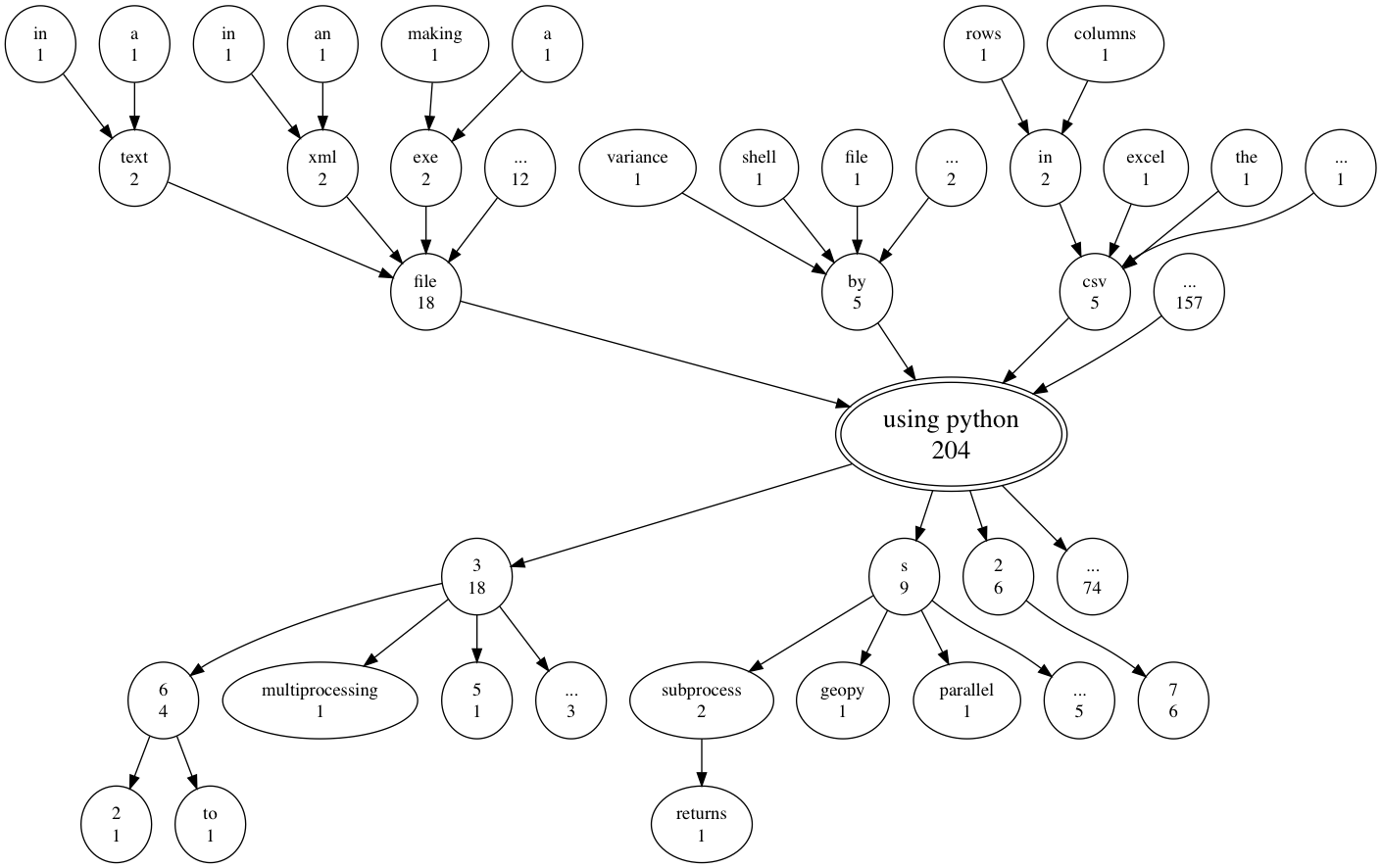
Notice that a lot of people talk about doing something with files using python, but most of the 204 questions with the phrase ‘using python’ are not captured by the three most common previous or next words. Another thing this plot shows is that all six people who used the phrase ‘using python 2’ said ‘using python 2.7’.
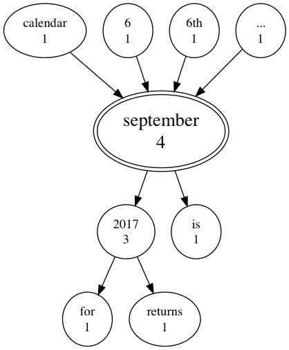
To make this word tree, we looked at all question titles, not just the ones tagged ‘python’. We can use our word tree function to explore how any phrase is used in question titles. For example, we can see if anyone mentioned ‘september’ in the first two weeks of September.
select_text('september')
Visualizing Time
In this section we look at time both in terms of hour of the day and as the latency between a question and an answer. We will investigate the following three questions.
- What time of day do people post?
- How quickly were questions answered?
- Was the latency in answer time faster for some languages than others?
What time of day do people post?
To make sure that timezones are not influencing the results, we will only plot the hour of the day for users in the United Kingdom. Pandas allows us to make a histogram without using another library, but first we must pull out the hour from each timestamp.
posts[posts['Location'] == 'London, United Kingdom']['CreationDate'].apply(lambda x: x.hour).hist(bins=range(24))
plt.xlabel('Hour of day on a 24 hour clock')
plt.ylabel('Number of posts')
plt.show()
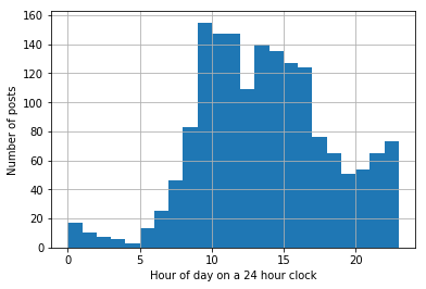
Looking at this distribution it appears that English posters are usually active during work and take a break for lunch. It is interesting that the number of posts spike around midnight, and a thorough researcher would do well to check if there is any chance that midnight posts are due to accounting errors.
How quickly were questions answered?
When someone asked a question, how many minutes did it take to get an answer?
Let’s start by calculating the latency for each question and finding the median answer time.
# aggregate answers by question id
answers_by_question = answers.groupby('QuestionId')['CreationDate'].agg(min)
# get the earliest creation date for each answer
first_reply = pd.DataFrame({'PostId':answers_by_question.index.values, 'EarliestReply':answers_by_question.values})
# add the time of the earliest answer to the questions data frame (filtering out questions which were not answered)
first_reply = pd.merge(first_reply, questions, how='inner', on=['PostId'])

# get the time it took to get an answer
first_reply['Latency'] = (first_reply['EarliestReply']-first_reply['CreationDate'])
# convert to minutes
first_reply['Latency'] /= pd.Timedelta(minutes=1)

# find the median
print('Median answer time for questions asked and answered in the first two weeks of September 2017 is {0:.2f} min.'.format(first_reply['Latency'].median()))
Median answer time for questions asked and answered in the first two weeks of September 2017 is 30.58 min.
To get a better idea of the distribution of question to answer latency, let’s plot a histogram of this data. Since this distribution probably has a long tail, let’s use a log scale.
# Let's plot the data
first_reply['Latency'].hist(bins=50)
plt.yscale('log', nonposy='clip')
plt.ylabel('Number of Questions')
plt.xlabel('Time in Minutes')
plt.show()
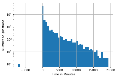
Do you notice a particularly odd value in this chart?
How can we have an answer before the question was asked?
weird_questions = first_reply[first_reply['EarliestReply'] < first_reply['CreationDate']]
links = weird_questions.apply(lambda p: get_link(p, desc='answered before question'), axis=1)
display(HTML('<br/>'.join(links)))
Question 46067060 answered before question
If you follow the link above, you will see that according to the timestamps a question on PHP and MySQL was answered 5 days before it was asked. I think you’d have to contact Stack Overflow to figure out what happened here.
Was there a difference in latency based on the language asked about?
We can also look at differences in latency between tags using a box plot.
Let’s use seaborn to do this.
As we saw in the histogram above, the distribution has a very long tail.
For this reason I think it is easier to read without fliers (points beyond the whiskers) and on a log scale.
You are welcome to set showfliers to True and comment out the line ax.set(yscale="log") if you’d like to see the chart on a linear scale with fliers.
some_tags = ['plotly', 'python', 'r', 'tableau']
df = pd.DataFrame()
for t in some_tags:
    t_search = t.replace('+','\+')
    tag_items = pd.DataFrame(first_reply[first_reply['Tags'].str.contains('<'+t_search+'>')]['Latency'])
    tag_items['Tag'] = t
    df = df.append(tag_items)

# the following line sorts the chart by the median latency
some_tags.sort(key = lambda t: df[df['Tag'] == t]['Latency'].median())

ax = sns.boxplot(x="Tag", y="Latency", order=some_tags, data=df, showfliers=False)
ax.set(yscale="log")
plt.ylabel('Minutes to Get an Answer on Stack Overflow (Log Scale)')
plt.xlabel('Question Programming Language')
plt.savefig('box-and-whisker.png', dpi=200)
plt.show()
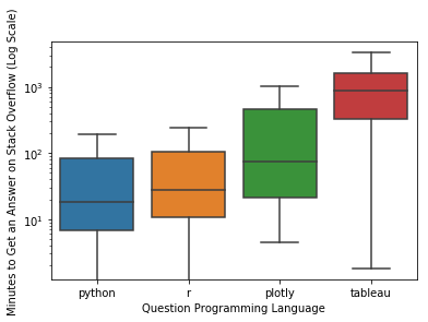
If you are curious about other languages, try editing some_tags in the code above.
Plot Connections
We can model user interactions as a graph by making an edge from each person who answers a question to the person who posted that question. We can then use graphviz to visualize this graph.
To start with, we need to compute the edges between non-null users.
# filter out null users and get question ids
from_edges = answers.loc[answers['UserId'].notnull(),['UserId', 'QuestionId']]
from_edges.rename(columns={'UserId':'AnswerUID', 'QuestionId':'PostId'}, inplace=True)
# filter out null users and get question ids
to_edges = questions.loc[questions['UserId'].notnull(),['UserId','PostId']]
# merge on question id
links = pd.merge(from_edges, to_edges, on='PostId', how='inner')
# use a counter to merge duplicate edges to get edge weights
edges = Counter(links.apply(lambda x:(x['AnswerUID'], x['UserId']), axis=1).tolist())
edges.most_common(10)
The user pairs with the most interactions are as follows:
[((454137.0, 5962284.0), 9),
 ((2700673.0, 2700673.0), 7),
 ((220679.0, 8511822.0), 7),
 ((6703783.0, 6703783.0), 6),
 ((7497809.0, 7497809.0), 6),
 ((217408.0, 5846565.0), 6),
 ((2901002.0, 6171086.0), 6),
 ((4781268.0, 8601053.0), 6),
 ((7294900.0, 8493186.0), 5),
 ((7292772.0, 1422604.0), 5)]
Let’s use user reputation to color the nodes in our graph.
repuatation_map = dict(zip(posts['UserId'], posts['Reputation']))
Let’s make some functions to visualize our graph.
Graphviz has a few algorithms for deciding where nodes go. You can choose between them use the prog attribute when you create the graph image. The default option is dot, which works well for trees, but makes less sense for visualizing social networks. The full list of options is:
- dot - “hierarchical” or layered drawings of directed graphs. This is the default tool to use if edges have directionality.
- neato - “spring model’’ layouts. This is the default tool to use if the graph is not too large (about 100 nodes) and you don’t know anything else about it. Neato attempts to minimize a global energy function, which is equivalent to statistical multi-dimensional scaling.
- fdp - “spring model’’ layouts similar to those of neato, but does this by reducing forces rather than working with energy.
- twopi - radial layouts, after Graham Wills 97. Nodes are placed on concentric circles depending their distance from a given root node.
- circo - circular layout, after Six and Tollis 99, Kauffman and Wiese 02. This is suitable for certain diagrams of multiple cyclic structures, such as certain telecommunications networks.
In this example, nodes don’t have labels and are filled according to a user’s reputation. If you would like to label nodes with the user’s id, just change label='' to label=uid in make_node. In this example darker colors signify user’s with less reputation. To change this just add val = 255 - val in get_fill. I like magenta, but if you want a different overall color to the graph, change the return statement for get_fill. These are some simple options:
- gray = [val, val, val]
- red = [val, 0, 0]
- green = [0, val, 0]
- blue = [0, 0, val]
- yellow = [val, val, 0]
- cyan = [0, val, val]
# a function to get a fill color based on reputation
def get_fill(uid):
    rep = repuatation_map[int(uid)]
    # The distribution of reputations is very lop-sided, so let's use log reputation for our scale
    # the value should be between 0 and 255
    val = np.log(rep)/np.log(max(repuatation_map.values())) * 255
    return to_hex([val, 0, val])

# turn a RGB triplet into a hex color graphviz will understand
def to_hex(triple):
    output = '#'
    for val in triple:
        # the hex function returns a string of the form 0x<number in hex>
        val = hex(int(val)).split('x')[1]
        if len(val) < 2:
            val = '0'+val
        output += val
    return output

# The function to visualize our network graph
# It takes in a list of edges with weights
def build_network(edges_with_weights, prog='neato'):
    # The function which builds each node. You can change the node style here.
    make_node = lambda uid: graphviz.Node(uid, label='', shape='circle', style='filled', fillcolor=get_fill(uid), color='white')
    graph = graphviz.Dot()
    # A dictionary to keep track of node objects
    nodes = {}
    for pair in edges_with_weights:
        e, w = pair
        e = (str(int(e[0])), str(int(e[1])))
        # Add notes to the graph if they don't exist yet
        if e[0] not in nodes:
            nodes[e[0]] = make_node(e[0])
            graph.add_node(nodes[e[0]])
        if e[1] not in nodes:
            nodes[e[1]] = make_node(e[1])
            graph.add_node(nodes[e[1]])
        graph.add_edge(graphviz.Edge(nodes[e[0]], nodes[e[1]], penwidth=(float(w)/2)))
    return Image(graph.create_png(prog=prog))
Now let’s make a small chart that just contains the edges with the highest weights.
# Let's build a small network from the edges with the highest weights.
build_network(edges.most_common(10))
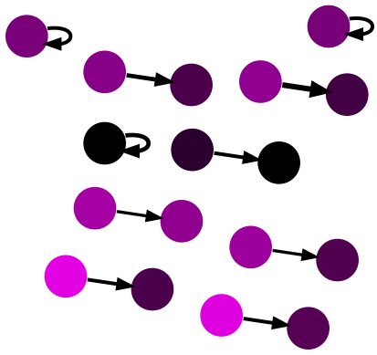
Notice that a two of the ten highest weighted edges are self loops.
Who are the posters who answer their own questions so many times and what are the questions that they post and answer?
def show_self_links(uid):
    self_links = links.loc[(links['AnswerUID'] == uid) & (links['UserId'] == uid),:].copy()
    self_links['PostType'] = 'Question'
    display(HTML('<br/>'.join(self_links.apply(lambda p: get_link(p, 'is a self link for '+str(uid)), axis=1))))

for self_linker in [x[0][0] for x in edges.most_common(10) if x[0][0] == x[0][1]]:
    show_self_links(self_linker)
Question 46023973 is a self link for 2700673.0
Question 46037300 is a self link for 2700673.0
Question 46080800 is a self link for 2700673.0
Question 46052663 is a self link for 2700673.0
Question 46101548 is a self link for 2700673.0
Question 46120860 is a self link for 2700673.0
Question 46158975 is a self link for 2700673.0
Question 46010706 is a self link for 6703783.0
Question 46079189 is a self link for 6703783.0
Question 46030584 is a self link for 6703783.0
Question 46083631 is a self link for 6703783.0
Question 46043621 is a self link for 6703783.0
Question 46113339 is a self link for 6703783.0
Question 46030060 is a self link for 7497809.0
Question 46028490 is a self link for 7497809.0
Question 46044933 is a self link for 7497809.0
Question 46065375 is a self link for 7497809.0
Question 46167740 is a self link for 7497809.0
Question 46208353 is a self link for 7497809.0
As we can see from the sample of edges above, this may not be a connected graph. Let’s pick a sample of edges and plot a connected subgraph.
def find_connected_subgraphs(edges):
    nodes = list(set([n for e in edges for n in e]))
    mappings = dict(zip(nodes, range(len(nodes))))
    flipped_mappings = dict(zip(range(len(nodes)), [[n] for n in nodes]))
    for e in edges:
        c_1 = mappings[e[0]]
        c_2 = mappings[e[1]]
        if c_1 == c_2:
            continue
        if len(flipped_mappings[c_1]) > len(flipped_mappings[c_2]):
            tmp = c_1
            c_1 = c_2
            c_2 = tmp
        for n in flipped_mappings[c_1]:
            mappings[n] = c_2
            flipped_mappings[c_2].append(n)
    return mappings

num_edges = 2000
connection_mapping = find_connected_subgraphs([x[0] for x in edges.most_common(num_edges)])
Counter(connection_mapping.values()).most_common(10)
The returned list gives an identification number for each connected subgraph and the number of nodes which are in that subgraph:
[(1938, 149),
 (874, 33),
 (908, 31),
 (1844, 24),
 (1175, 22),
 (2361, 19),
 (2457, 14),
 (810, 13),
 (2633, 10),
 (1853, 10)]
33 nodes seems like a large enough graph. An image of a 149 node network would be difficult to read.
Note: If you plot a graph with over 500 nodes you might overwhelm graphviz
subgraph_id_number = 874
e_list = [x for x in edges.most_common(num_edges) if connection_mapping.get(x[0][0],None) == subgraph_id_number]
build_network(e_list)
Notice that other than accounts which answer their own questions, no one in this graph is both a question asker and a question answerer.
Is this because we are only looking at thick edges or can stack overflow users really be partitioned into questioners and answerers?
# can stack overflow users be partitioned into questioners and answerers?
answerers = set([e[0] for e in edges.keys() if e[0] != e[1]])
questioners = set([e[1] for e in edges.keys() if e[0] != e[1]])
both_question_and_answer = (answerers & questioners)
percentage = len(both_question_and_answer)/len(answerers | questioners)*100

print('{0:.2f}% of users both answered and asked questions'.format(percentage))
3.98% of users both answered and asked questions
# let's find a subgraph with users who both asked and answered questions
condition = lambda e: (e[0] in both_question_and_answer) or (e[1] in both_question_and_answer)
connection_mapping = find_connected_subgraphs([e for e in edges if condition(e)])
Counter(connection_mapping.values()).most_common(10)
The returned list gives an identification number for each connected subgraph that contains an account that both asked and answered questions in the two week window that the data represents. The second value in each tuple gives the number of nodes which are in that subgraph. Note that we are now looking at all edges, not just the 2,000 highest weighted edges:
[(5095, 11268),
 (4015, 38),
 (6820, 20),
 (13003, 19),
 (12374, 19),
 (12686, 17),
 (6447, 17),
 (11400, 16),
 (4247, 15),
 (10804, 15)]
Let’s plot subgraph 6920 since a 20 node chart is large enough to be interesting but small enough to be easy to read.
subgraph_id_number = 6820
e_list = [(e, edges[e]) for e in edges if condition(e) and connection_mapping.get(e[0],None) == subgraph_id_number]
build_network(e_list)
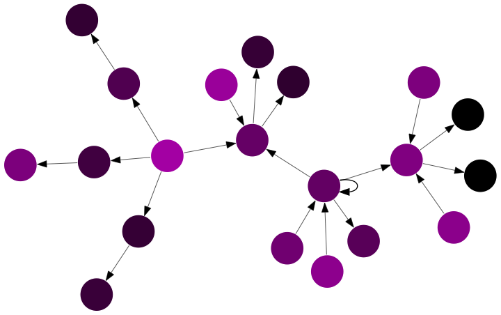
Notice that people who only answer have higher reputations than users who both post and answer questions.
In this tutorial we are only looking at data in a two week timespan and we only visualized subgraphs that were small enough to easily interpret. This is not a bad place to start, but a full investigation into user behavior should account for the possibility that more users would both ask and answer questions if a larger time window were investigated. In a full investigation, we would also want to think about how to understand and describe the larger subgraphs. This process can be helped by thinking about statistics that make sense for smaller components and using them to model behavior in the larger subgraphs.
Plot Places
Where do people say they are from?
In this example we’ll look at how to make maps in python and why making maps is so hard.
Let’s start by adding information on each location from the Google Maps API.
location_data = pd.read_csv('loc_data.csv')
location_data['Google_Data'] = location_data['Google_Data'].apply(lambda x: eval(x))

location_data['Google_Data'].apply(len).hist()
#plt.yscale('log', nonposy='clip')
plt.title('Was Google Able to Find a Unique Location from the Location String?')
plt.xlabel('Number of Matches')
plt.ylabel('Number of Unique Place Strings')
plt.show()
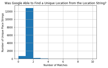
Let’s only work with data that had a unique match and check how precise that match is.
location_data = location_data[location_data['Google_Data'].apply(len) == 1]
posts_with_location = pd.merge(posts, location_data, how='inner', on='Location')
# get the lowest level of location data for each row
def get_lowest_component(address_list):
components = address_list[0]['address_components']
all_parts = []
for c in components:
if len(c['types']) == 2 and c['types'][1] == 'political':
all_parts.append(c['types'][0])
if len(all_parts) > 0:
return all_parts[0]
return None
posts_with_location = pd.merge(posts, location_data, how='inner', on='Location')
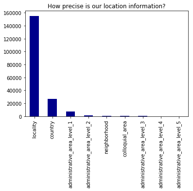
lowest_components = posts_with_location['Google_Data'].apply(get_lowest_component).value_counts()
Now let’s plot the lowest_components to see how precise each match is.
lowest_components.plot(kind='bar', color='DarkBlue')
plt.title("How precise is our location information?")
plt.show()
Let’s add information on each level of location we have available
def get_part(address_list, level='country', name_type='long_name'):
    components = address_list[0]['address_components']
    for c in components:
        if c['types'] == [level, 'political']:
            return c[name_type]
    return None

for part in lowest_components.index:
    posts_with_location[part] = posts_with_location['Google_Data'].apply(lambda x: get_part(x, level=part))

posts_with_location.head()
| PostId | Score | PostType | CreationDate | Title | UserId | Reputation | Location | Tags | QuestionId | Google_Data | locality | country | administrative_area_level_1 | administrative_area_level_2 | neighborhood | colloquial_area | administrative_area_level_3 | administrative_area_level_4 | administrative_area_level_5 | |
|---|---|---|---|---|---|---|---|---|---|---|---|---|---|---|---|---|---|---|---|---|
| 0 | 46009270 | 0 | Question | 2017-09-02 00:00:07 | Android: AlarmManager running every 24h - is i... | 8281994.0 | 173.0 | Germany | <android><alarmmanager> | NaN | [{'formatted_address': 'Germany', 'geometry': ... | None | Germany | None | None | None | None | None | None | None |
| 1 | 46016558 | 2 | Question | 2017-09-02 17:47:19 | How to get $_GET variables in PHP containing f... | 2727993.0 | 125.0 | Germany | <php><.htaccess><variables><mod-rewrite> | NaN | [{'formatted_address': 'Germany', 'geometry': ... | None | Germany | None | None | None | None | None | None | None |
| 2 | 46016593 | 0 | Answer | 2017-09-02 17:50:43 | NaN | 1515052.0 | 9960.0 | Germany | NaN | 46012486.0 | [{'formatted_address': 'Germany', 'geometry': ... | None | Germany | None | None | None | None | None | None | None |
| 3 | 46016591 | 0 | Question | 2017-09-02 17:50:29 | Swift 3 - Isolate a function | 8552404.0 | 1.0 | Germany | <swift3> | NaN | [{'formatted_address': 'Germany', 'geometry': ... | None | Germany | None | None | None | None | None | None | None |
| 4 | 46018754 | 0 | Answer | 2017-09-02 22:25:57 | NaN | 6811411.0 | 8279.0 | Germany | NaN | 46018092.0 | [{'formatted_address': 'Germany', 'geometry': ... | None | Germany | None | None | None | None | None | None | None |
One way to plot location is to just make a convex hull around each set of latitude and longitude points.
MissingNo will do this if you want to visualize differences in where data is missing.
def get_lat_long(address_list):
    location = address_list[0]['geometry']['location']
    return location['lat'], location['lng']

posts_with_location['lat_lng'] = posts_with_location['Google_Data'].apply(get_lat_long)
posts_with_location['lat'] = posts_with_location['lat_lng'].apply(lambda x: x[0])
posts_with_location['lng'] = posts_with_location['lat_lng'].apply(lambda x: x[1])
msno.geoplot(posts_with_location, x='lng', y='lat', by='country')

This map was easy to make and kind of fun to look at. It shows the places in China people actually live and captures the fact that many African countries are completely unrepresented in our dataset.
Building a Better Map
Using shape files we can create better maps that have the correct outlines for each region.
Let’s use Bokeh’s shape files to make a map of Stack Overflow use in US counties.
Building a better map requires shape files (recall the Bokeh sample data), and a lot of really annoying cleaning.
Shape files contain information on the boundaries of each area we are interested in.
Linking our data to these shape files is far from trivial. In this example we will plot US counties because shape files on US states and counties are easy to find.
I don’t go over map projections here, but the projection of a map can be changed by applying a projection function to a shape file (which is usually just stored in latitude and longitude). The projection function must be applied to each coordinate in the shape files.
Because linking data to shape files is such a pain, we’re not really going to get into the details here, but you can read the comments in the following cell later.
# get posts which were by someone in the United States
county_posts = posts_with_location.loc[posts_with_location['country'] == 'United States',:]
# group those post by state (administrative_area_level_1) and then county (administrative_area_level_1)
# this structure will be used later to get different stats from this aggregation
county_posts = county_posts.groupby(['administrative_area_level_1', 'administrative_area_level_2'])

# a function to count the number of questions with a given tag
def get_tag_count(series, tag='python'):
    return len(series[series.notnull() & (series.str.find('<'+tag+'>') > -1)])

# get basic stats which don't need to be calculated over and over
county_stats = county_posts.agg({'lat':np.mean, 'lng':np.mean, 'PostId':len,
                                'PostType':lambda x : len(x[x=='Question'])})

county_stats.reset_index(inplace=True)
county_stats = county_stats.rename(columns={'PostId':'posts', 'PostType':'questions', 'administrative_area_level_1':'State', 'administrative_area_level_2':'County'})

# get shape data for counties and states
counties = {
    code: county for code, county in counties.items()
}

us_states = us_states_data.data.copy()

name_to_code = dict([(counties[code]['detailed name'], code) for code in counties])

# a function to match counties from stack overflow data to data from shape files
def match_county(county):
    state = county['State']
    county_name = county['County']
    # take out non-ascii characters which are not in Bokeh file
    county_name = unicodedata.normalize('NFKD', county_name).encode('ascii','ignore').decode("utf-8")
    full_name = county_name + ', ' + state
    if full_name in name_to_code:
        return name_to_code[full_name]
    # some counties end with county in one dataset but not the other
    # in these cases, just match with the closest string from the same state
    close_matches = [n for n in name_to_code.keys() if n.endswith(state) and n.startswith(county_name.split(' ')[0])]
    if len(close_matches) == 0:
        print(full_name)
        return None
    full_name = min(close_matches, key=len)
    return name_to_code[full_name]

# get a code to match stack overflow data to shape file data
county_stats['code'] = pd.Series(county_stats.apply(match_county, axis=1))

# make a function to build the map in Bokeh
def build_map(county_stats, county_posts, county_slice=None, language='python'):
    color_mapper = LogColorMapper(palette=palette)

    if county_slice is not None:
        county_stats = county_stats[county_slice]

    county_xs = county_stats['code'].apply(lambda code: counties[code]["lons"]).tolist()
    county_ys = county_stats['code'].apply(lambda code: counties[code]["lats"]).tolist()
    county_names = (county_stats["County"]+', '+county_stats["State"]).tolist()

    language_perc = county_posts['Tags'].agg(lambda x: get_tag_count(x, language))
    language_perc = language_perc.reset_index()
    if county_slice is not None:
        language_perc = language_perc[county_slice]
    language_perc = (language_perc['Tags']/county_stats['questions'])
    language_perc = (language_perc*100).tolist()

    posts_source = ColumnDataSource(data=dict(
        x=county_xs,
        y=county_ys,
        name=county_names,
        posts=county_stats['posts'].tolist(),
        questions=county_stats['questions'].tolist(),
        lang_posts=language_perc
    ))

    TOOLS = "pan,wheel_zoom,reset,save"

    p = figure(
        title=language.title() + " Posts by County", tools=TOOLS,
        x_axis_location=None, y_axis_location=None,
        plot_width=900
    )
    p.grid.grid_line_color = None

    county_pathches = Patches(xs="x", ys="y",
              fill_color={'field': 'lang_posts', 'transform': color_mapper},
              fill_alpha=0.7, line_color="white", line_width=0.5)
    county_pathches_render = p.add_glyph(posts_source, county_pathches)

    # add hover tooltip
    hover = HoverTool(renderers=[county_pathches_render], tooltips=[
        ("Name", "@name"),
        ("Posts", "@posts"),
        ("Questions", "@questions"),
        ("% "+language.capitalize(), "@lang_posts")])
    p.add_tools(hover)

    # -----------
    # Add state outlines
    # -----------
    filter_fun = lambda x : x != 'AK' and x != 'HI'
    # get lat and long as x and y
    state_xs = [us_states[code]["lons"] for code in us_states if filter_fun(code)]
    state_ys = [us_states[code]["lats"] for code in us_states if filter_fun(code)]

    # draw state lines
    p.patches(state_xs, state_ys, fill_alpha=0.0, line_color="#"+('9'*6), line_width=0.5)

    show(p)
Now we can use our build_map function to plot percent of posts that were about python for each county in the United States.
build_map(county_stats, county_posts)
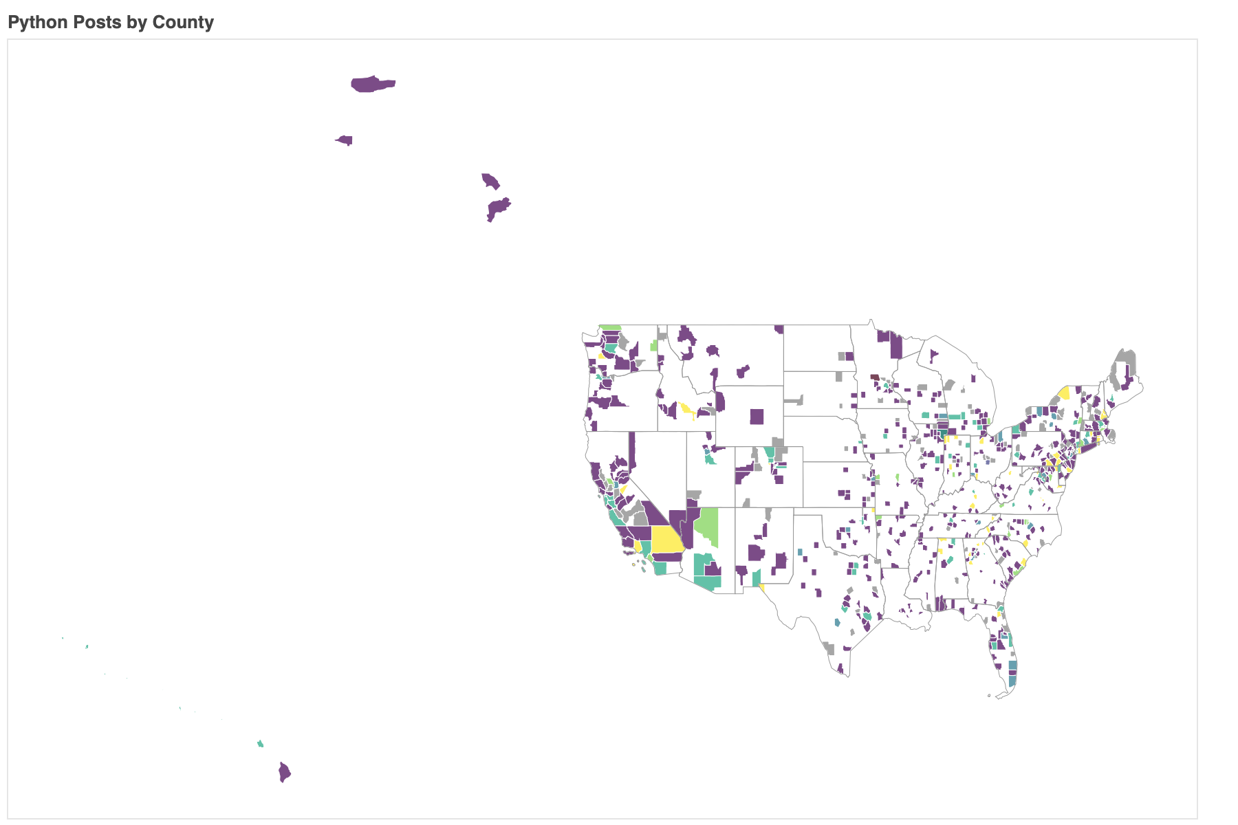
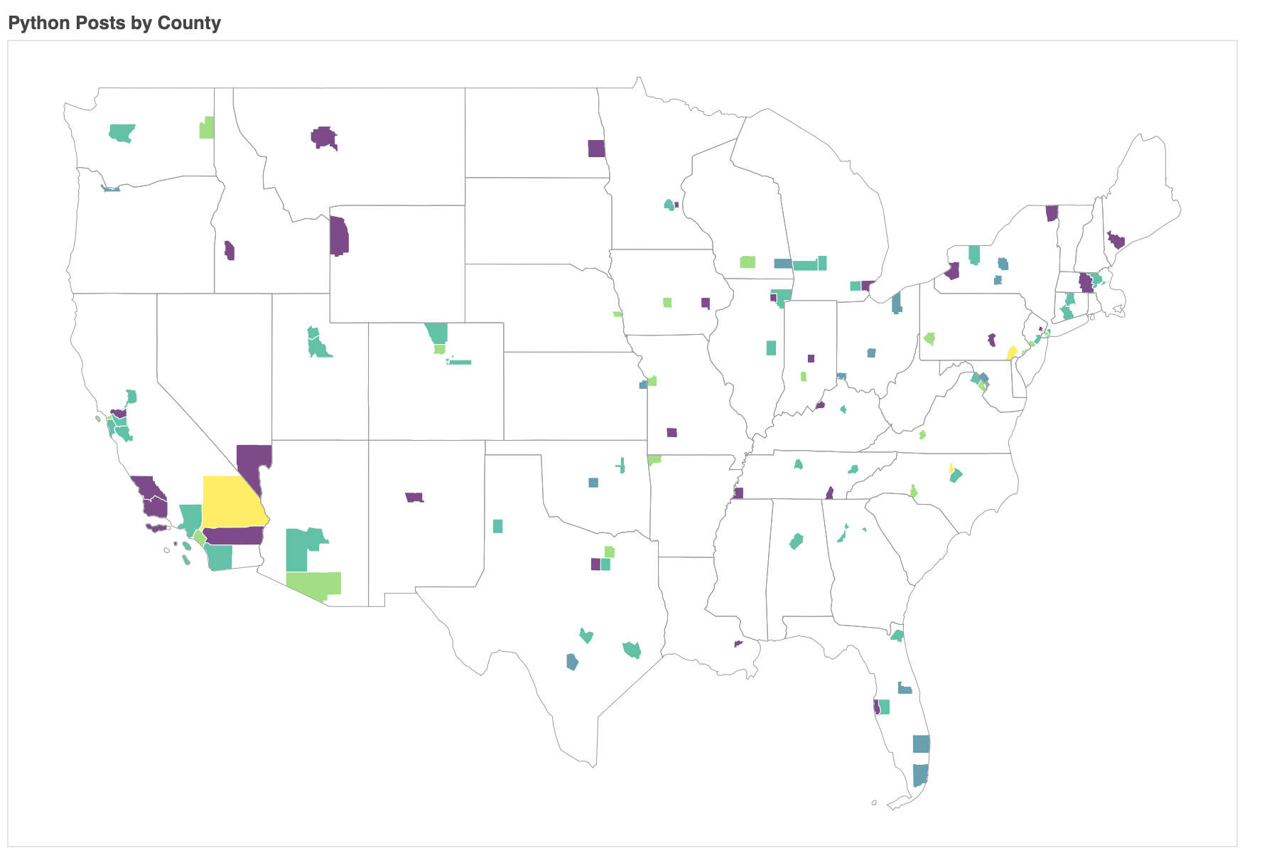
Some of the yellow counties only have 1 or 2 posts, so concluding that there is a strong python community in those areas might be a mistake. To concentrate on counties that have at least a few posts in our dataset, we can filter the posts so only counties with at least a post every other day are shown.
build_map(county_stats, county_posts, county_stats['questions'] > 7, language='python')
Conclusion
Hopefully this tutorial taught you something new about visualization in python.
You can find the code at http://github.com/kbrady/pytn_2018
Some key points I’d like to highlight are:
- Visualize early - making visualizations early on can help a lot with data cleaning
- Visualize for yourself first - visualization is a powerful tool for showing you what is going on in your data and if you can’t understand your own visualizations, no one else will
- Barcharts are awesome, but not everything should be a barchart - wordtrees, network diagrams and heatmaps are also nice